
Abstract
Massive unemployment during the COVID-19 pandemic could result in an eviction crisis in US cities. Here we model the effect of evictions on SARS-CoV-2 epidemics, simulating viral transmission within and among households in a theoretical metropolitan area. We recreate a range of urban epidemic trajectories and project the course of the epidemic under two counterfactual scenarios, one in which a strict moratorium on evictions is in place and enforced, and another in which evictions are allowed to resume at baseline or increased rates. We find, across scenarios, that evictions lead to significant increase in infections. Applying our model to Philadelphia using locally-specific parameters shows that the increase is especially profound in models that consider realistically heterogenous cities in which both evictions and contacts occur more frequently in poorer neighborhoods. Our results provide a basis to assess municipal eviction moratoriums and show that policies to stem evictions are a warranted and important component of COVID-19 control.
Introduction
The COVID-19 epidemic has caused an unprecedented public health and economic crisis in the United States. The eviction crisis in the country predated the pandemic, but the record levels of unemployment have newly put millions of Americans at risk of losing their homes [1–7]. Many cities and states enacted temporary legislation banning evictions during the initial months of the pandemic [8,9], some of which have since expired. On September 4th, 2020, the Centers for Disease Control and Prevention, enacting Section 361 of the Public Health Service Act [10], imposed a national moratorium on evictions until December 31st, 2020 [11]. This order, like most state and municipal ordinances, argues that eviction moratoriums are critical to prevent the spread of SARS-CoV-2. It is currently being challenged in federal court (Brown vs Azar [12]), as well as at the state and local level [13,14].
Evictions have many detrimental effects on households that could accelerate the spread of SARS-CoV-2. There are few studies on the housing status of families following eviction [15,16], but the limited data suggest that most evicted households “double-up”--moving in with friends or family--immediately after being evicted (see Methods). Doubling up shifts the distribution of household sizes in a city upward. The role of household transmission of SARS-CoV-2 is not fully understood, but a growing number of empirical studies [17–22], as well as previous modeling work [23,24] suggest households are a major source of SARS-CoV-2 transmission. Contact tracing investigations find at least 20-50% of infections can be traced back to a household contact [25–27]. Household transmission can also limit or delay the effects of measures like lockdowns, that aim to decrease the contact rate in the general population [18,23,28].
Here we use an epidemiological model to quantify the effect of evictions, and their expected shifts in household size, on the transmission of SARS-CoV-2, and the prospects of its control, in cities (Figure 1). We modify an SEIR (susceptible, exposed, infectious & recovered) model, previously described in Nande 2020 [23], to track the transmission of SARS-CoV-2 through a metropolitan area with a population of 1 million individuals. We use a network to represent contacts, of the type that can potentially lead to transmission of SARS-CoV-2, between individuals grouped in households. We modulate the number of contacts outside the household over the course of the simulations to capture the varied effects of lockdown measures and their subsequent relaxation. We model evictions that result in ‘doubling up’ by merging each evicted household with one randomly-selected household in the network.
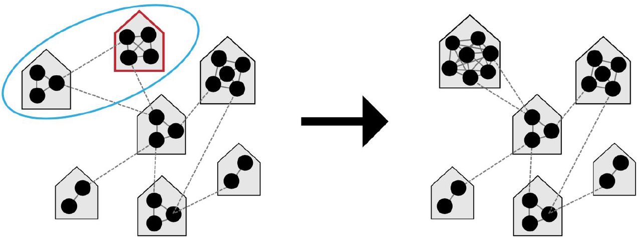
We model the spread of infection over a transmission network where contacts are divided into those occurring within a household (solid grey lines) versus outside the house (“external contacts”, dotted grey lines). Social distancing interventions (such as venue and school closures, work-from-home policies, mask wearing, lockdowns, etc) are modeled as reductions in external contacts, while relaxations of these interventions result in increases in external contacts towards their baseline levels. When a household experiences eviction (red outline), we assume the residents of that house “double-up” by merging with another house (blue circle), thus increasing their household contacts.
The model is parameterized using values from the COVID-19 literature and other demographic data (see Methods). The timing of progression between stages in our epidemiological model is taken from many empirical studies and agrees with other modeling work: We assume an ∼4 day latent period, ∼8 day serial interval and R0 ∼ 3 in the absence of interventions, and ∼1% infection fatality risk. Household sizes are taken from the US Census [29]; households are assumed to be well-mixed, meaning all members of a household are in contact with each other. Individuals are randomly assigned contacts with individuals in other households. The number and strength of these “external” contacts is chosen so that the household secondary attack rate is ∼0.3 [20], and the probability of transmission per contact is approximately 2.3-fold higher for households, compared to external contacts [19]. Our model naturally admits a degree of overdispersion in individual-level R0 values. Baseline eviction rates, which we measure as percent of households evicted each month, vary dramatically between cities at baseline, as do the expected increases due to COVID-19 (Supp. Figure 2, [30,31]). To capture this range of eviction burdens, we simulate city-wide eviction rates ranging from 0.1 - 2.0%.

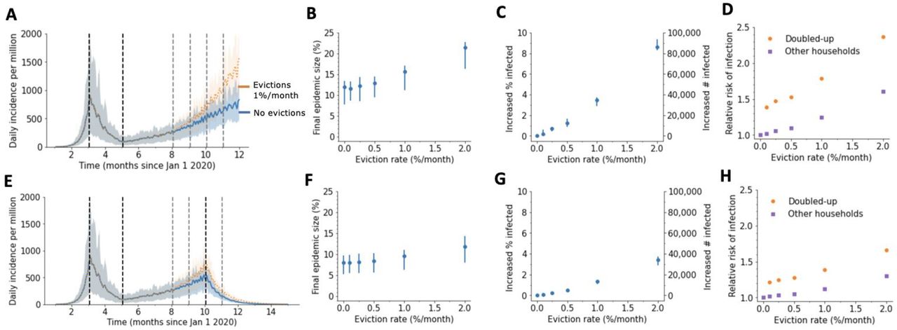
We model evictions occurring in the context of an epidemic with a large first wave and a strong lockdown occurring on April 1, followed by a slow comeback after relaxation of control measures on June 1. Monthly evictions start Sept 1, with a 4-month backlog processed on the first month. A) The projected daily incidence of new infections (7-day running average) with and without evictions. Shaded regions represent central 90% of all simulations.The first lockdown (dotted vertical line) reduced external contacts by 85%, and under relaxation (second dotted line) they were still reduced by 70%. B) Final epidemic size by Dec 31 2020, measured as percent individuals who had ever been in any stage of infection. C) The predicted increase in infections due to evictions through Dec 31 2020, measured as excess percent of population infected (left Y-axis) or number of excess infections (right Y-axis). Error bars show interquartile ranges across simulations. D) Relative risk of infection in the presence versus absence of evictions, for individuals who merged households due to evictions (“Doubled-up”) and for individuals who kept their pre-epidemic household (“Other households”). E)-F) Same as above but assuming a second lockdown is instituted on Nov 1, and maintained through March 2021.
Our initial models assume that mixing between households occurs randomly throughout a city, and that evictions and the ability to adopt social distancing measures is uniformly distributed. However, data consistently show that both COVID-19 and evictions disproportionately affected the same poorer, minority communities [32–38]. We therefore extend our model to evaluate the effect of evictions in a realistically heterogeneous city. We provide generic results, and then parameterize our model to a specific example--the city of Philadelphia, Pennsylvania.
Among large US cities, Philadelphia has one of the highest eviction rates. In 2016 (the last year complete data is available), 3.5% of renters were evicted, and 53% were cost-burdened, meaning they paid more than 30% of their income in rent [30,39]. In July 2020 the Philadelphia city council passed the Emergency Housing Protection Act [40], in an effort to prevent evictions during the COVID-19 pandemic. The city was promptly sued by HAPCO, an association of residential investment and rental property owners [41]. Among other claims, the plaintiff questioned whether the legislation was of broad societal interest, rather than protecting only a narrow class (of at-risk renters). An early motivation behind this work was to assess this claim.
Results
We simulate COVID-19 epidemic trajectories in single US metro areas over the course of 2020. Many local, county, and state-level eviction moratoriums that were created early in the US epidemic were scheduled to expire in late summer 2020, so we modeled the effect of evictions taking place starting Sept 1 and continuing for the duration of the simulation. We assume that evictions happen at a constant rate per month, but that the backlog of eviction cases created during the moratoriums results in 4 months worth of evictions occurring in the first month.
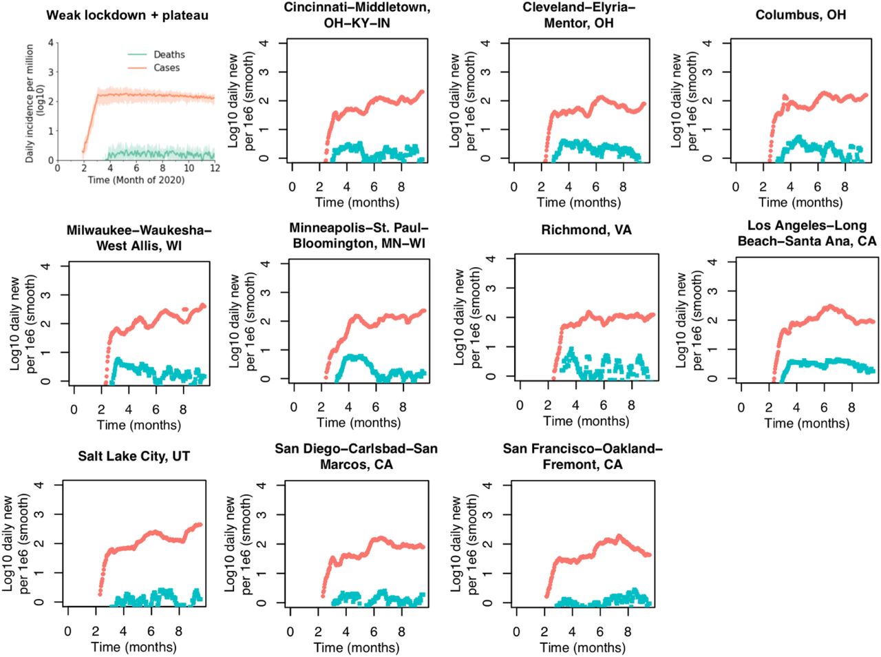
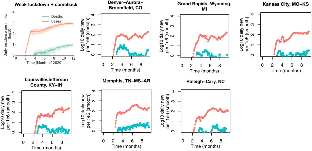
We first considered an epidemic trajectory similar to what has been seen across many major cities hit by early outbreaks (e.g. Baltimore/DC, Boston, Chicago, New Orleans, Sacramento, San Jose, Seattle, Detroit, see Figure S3,4): A large early epidemic peak followed by a strong lockdown that dramatically reduced cases, then a weak relaxation that led case counts to begin to creep up again, with the potential for a comeback in Fall 2020 (Figure 2). By the end of 2020, with a low eviction rate of 0.25%/month about 0.7% more of the population had caught COVID-19 compared to if there were no evictions. This increase corresponds to ∼7,000 excess cases per million residents. With a 2%/month eviction rate the infection level was ∼6% higher than baseline. Without evictions in this scenario about 10% of the population became infected by the simulation end point (Dec 31). The exact values vary across simulations due to all the stochastic factors in viral spread considered in the simulation.
Our model predicts that even for lower eviction rates that don’t dramatically change the population-level epidemic burden, the individual risk of infection was always substantially higher for those who experienced eviction, or who merged households with those who did (relative risk of infection by the end of the year, 1.4). However, the increased risk of infection was not only felt by those who doubled-up: for individuals who were neither evicted nor merged households with those who did, the risk of infection relative the counterfactual scenario of no evictions was 1.05 for an eviction rate of 0.25%/month and 1.5 for 2.0% evictions per month (Figure 2D). This increased risk highlights the spillover effects of evictions on the wider epidemic in a city.
We then considered the same scenario but assumed the epidemic resurgence was countered with a second lockdown imposed on Nov 1. The epidemic was controlled in simulations with or without eviction, but the control was slower and less effective at reducing epidemic size when evictions were allowed to continue (Figure 2E-H). Following the epidemic until March 31 2021 at which point it was nearly eliminated locally, the final size was 0.2% greater with 0.25%/month evictions and 3% larger with 2%/month evictions. Larger households, created through eviction and doubling up, allow more residual spread to occur under lockdowns. Allowing evictions to resume will thus compromise the efficacy of future SARS-CoV-2 control efforts.
We repeated the above simulations with different values of the household SAR to check the sensitivity of our results to this value (Figure S9,10). As expected, when household transmission is more common (higher SAR, Figure S9) evictions have a slightly larger effect on the epidemic, and when it is less common (lower SAR, Figure S10), the effect of evictions is slightly smaller.
Cities across the US experienced diverse epidemic trajectories through August 2020, and the trend of spread in Fall 2020 is not known. We therefore evaluated the impact of evictions occurring in the context of scenarios inspired by the case and death counts aggregated for each of the 50 largest metropolitan areas in the US (Figure 3, also see Supplementary Figures S3-8 for metro data and suggested best corresponding scenario). We found that in all scenarios, evictions lead to significant increases in COVID-19 cases, with anywhere from ∼1,000 to ∼100,000 excess cases attributable to evictions depending on the eviction rate and the infection rate during evictions (Table 1).
Excess infections are measured as the increase in the cumulative percent of the population infected by Dec 31 2020 (or March 31 2021 if second lockdown implemented) if evictions resume on Sept 1, 2020, compared to if evictions were halted. For the case without evictions, the total cumulative percent infected is listed. Values are reported as median [IQR]. All results are from simulations of a metro area of 1 million individuals where evictions all result in “doubling up”. Corresponding epidemic trajectories are shown in Fig 2, 3. The US metropolitan statistical areas that roughly correspond to each scenario are shown in Figs S3-S8.

Each panel shows the projected daily incidence of new infections (7-day running average) with and without evictions at 1%/month with a 4 month backlog, starting on Sept 1 2020. Shaded regions represent central 90% of all simulations. The US metropolitan statistical areas that roughly correspond to each scenario are shown in Figures S3-S8.
In general, evictions had less impact on infection counts when the epidemic was controlled and maintained at a constant plateau throughout the fall (Figure 3). For example, a 1%/month eviction rate occurring in cities that had a strong lockdown early in the epidemic and only weakly relaxed those measures leads to only about 0.4% more infected individuals in the population since case counts are already expected to be low (Fig 3A). However, a flat epidemic curve could still be associated with substantial detrimental effects of evictions if the incidence at the plateau is still relatively high. For example, in cities that had a weak initial control (e.g. Fig 3D) as well as cities that are just recently recovering from large summer peaks (e.g. Fig 3G), the added infection burden due to evictions can become more significant. In both cases, a 1%/month eviction rate is predicted to lead to 0.8% and 2% more cases during Fall 2020, respectively.
If cities experience substantial “comebacks” or “second waves” during the final months of 2020 due to increases in contacts conducive to the spread of SARS-CoV-2, then the predicted effects of evictions on overall case counts can be very large. The increased household spread that results from eviction-driven doubling-up acts synergistically with spread between members of different households to amplify infection levels in the whole population. Even if very strong control measures are implemented later in the fall (i.e. “second lockdown”) these measures are unable to effectively stop an increasing infection burden when evictions are allowed to continue. In cities that have yet to experience a true surge of cases (e.g. Figure 3E), a comeback in Fall 2020 that peaked at levels similar to that seen in Spring 2020 in many northeastern cities could be bigger by 4% (∼1.3-fold) with a 1% eviction rate. In many of these second wave scenarios, there was ∼1 excess infection in the city attributable to each eviction that took place.
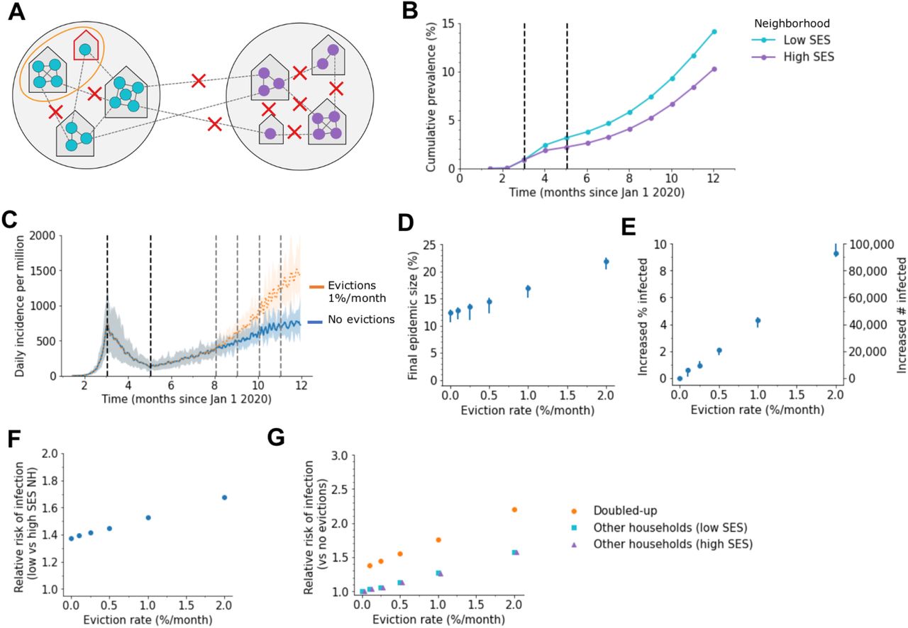
Our results so far assume that every household in a city is equally likely to experience an eviction, and that SARS-CoV-2 infection burden and adoption of social distancing measures are homogeneously distributed throughout the population. In reality, evictions are concentrated in poorer neighborhoods with higher proportions of racial/ethnic minorities [38]. Similarly, individuals in these neighborhood types are likely to maintain higher contact rates during the epidemic due to high portions of essential workers among other reasons [42–44]. Many studies have shown higher burdens of infection and severe manifestations of COVID-19 in these demographic groups [32–37]. To examine the impact of city-level disparities on the interaction between evictions and disease spread (Figure 4), we simulated infection in cities consisting of two neighborhood types: a higher socioeconomic status (SES) neighborhood with no evictions and a high degree of adoption of social distancing measures (low contact rates), and a lower SES neighborhood with evictions, where the reduction in contact rates was less pronounced. In the absence of evictions, infection prevalence differed substantially by neighborhood (Figure 4B), and despite simulating the same overall reduction in contacts, the epidemic burden was higher when residual contacts were clustered in the poorer neighborhood.

A) Schematic of our model for inequalities within a city. The city is divided into a “high socioeconomic status (SES)” (purple) and a “low SES” (teal) neighborhood. Evictions only occur in the low SES area, and individuals living in this area are assumed to be less able to adopt social distancing measures, and hence have higher contact rates under interventions (90% vs 75% reduction in external contacts during lockdown for 85% overall, 75% vs 53% during relaxation for 70% overall). Before interventions, residents are equally likely to contact someone outside the household who lives within vs outside their neighborhood. B) Cumulative percent of the population infected over time, by neighborhood, in the absence of evictions. C) The projected daily incidence of new infections (7-day running average) with 1%/month evictions vs no evictions. Shaded regions represent central 90% of all simulations. D) Final epidemic size by Dec 31 2020, measured as percent individuals who had ever been in any stage of infection, for the heterogenous city as compared to a homogenous city with same effective eviction rate and intervention efficacy. E) The predicted increase in infections due to evictions through Dec 31 2020, measured as excess percent of population infected (left Y-axis) or number of excess infections (right Y-axis). Error bars show interquartile ranges across simulations. F) Relative risk of infection by Dec 31 2020 for residents of the poor vs rich neighborhood. G) Relative risk of infection by Dec 31 2020 compared to a scenario with no evictions, for individuals who merged households due to evictions (“Doubled-up”) and for individuals who kept their pre-epidemic household (“Other households”).
In this heterogeneous context, we found, for equivalent overall eviction rates, larger impact of evictions on COVID-19 cases than if they had occurred in a homogeneous city. For example, by the end of 2020, for a low eviction rate (0.25%/month) we estimate 1% excess cases attributable to evictions in the heterogeneous model, as compared to 0.7% in the homogeneous version described above. For the higher eviction rate (2%/month) we estimate ∼9% excess infections due to eviction, as compared to ∼6% in the homogenous model. Evictions also serve to exacerbate pre-existing disparities in infection prevalence between neighborhoods. For the hypothetical scenario we simulated, evictions increase the relative risk of infection for the low vs. high SES neighborhood from ∼1.4 to ∼1.7. However, due to spillover effects, individuals residing in the high SES neighborhood also experience an increased infection risk (up to 1.5-fold the no-evictions scenario) attributable to the evictions occurring in the other demographic group. These results hold even if we assume more extreme segregation between residents of each neighborhood (Figure S11). Thus, our results in Table 1 may underestimate the impact of evictions on COVID-19 in realistically-heterogeneous US cities. The concentration of evictions in demographic groups with more residual inter-household transmission serves to amplify their effects on the epidemic across the whole city.
Finally, we sought to combine these ideas into a data-driven case study motivated by the court case in Philadelphia, PA, mentioned above. In Philadelphia, like all major US cities, there is significant heterogeneity in housing stability and other socioeconomic factors that are relevant both to the risk of eviction and to COVID-19 [45,46]. An early study found clusters of high incidence of infection were mostly co-located with poverty and a history of racial segregation, such as in West and North Philadelphia [34]. A study of SARS-CoV-2 prevalence and seropositivity in pregnant women presenting to the University of Pennsylvania Hospital System found a more than 4-fold increase in seroprevalence among Black/non-Hispanic and Hispanic/Latino women, compared to white/non-Hispanic women, between April and June 2020 [36].
To include these important disparities in our modeling, we first used principal component analysis on a suite of socioeconomic indicators to classify zip codes in the city [47]. We obtained three zip code typologies: a higher income cluster, a moderate income cluster, and a low income cluster. The lower income cluster has both very high eviction rates and higher rates of service industry employment and essential workers. We then translated these findings into our model by dividing the simulated city into three sub-populations. Evicted households were merged with other households in the same sub-population. The degree of adoption of social distancing measures in each sub-population was assumed to be proportional to the number of essential workers in that sub-population, ranging from highest (lowest contact rates) in the wealthier sub-population to lowest in the poorer sub-population. We did not further segregate individuals between different sub-populations and assumed homogeneous mixing of external contacts. Properties of the sub-populations are summarized in Table 3 and detailed in Supplementary Tables 1-2.
We tuned our models to roughly match our best available information on the COVID-19 epidemic trajectory in Philadelphia through September 1 2020 (Figure 5). The simulated epidemic grew exponentially with a doubling time of 4-5 days until late March when strong social distancing policies were implemented. Daily incidence of cases peaked shortly thereafter and deaths peaked with a delay of ∼ 1 month. Post-peak, new cases and death declined with a half-life of ∼ 3 weeks. In early June, control measures were relaxed, leading to a plateau in cases and deaths that lasted until Sept 1. By mid Sept roughly 11% of the population had ever been infected, in agreement with the most recent seroprevalence observed among pregnant women (as per [36], Hensley, personal communication). Our model predicted large disparities in seroprevalence among the clusters.

A) Map of Philadelphia, with each zip code colored by the cluster it was assigned to. Properties of clusters are Table 2 and Supplemental Tables 1-2 B) Schematic of our model for inequalities within the city. Each cluster is modeled as a group of households, and the eviction rate and ability to adopt social distancing measures vary by cluster. C) Simulated cumulative percent of the population infected over time, by cluster, in the absence of evictions. Data points from seroprevalence studies in Philadelphia or Pennsylvania: x [49], + [35], triangle [50], square [36]. D) The projected daily incidence of new infections (7-day running average) with evictions at 5-fold the 2019 rate vs no evictions. Shaded regions represent central 90% of all simulations. E) Final epidemic size by Dec 31 2020, measured as percent individuals who had ever been in any stage of infection. F) The predicted increase in infections due to evictions through Dec 31 2020, measured as excess percent of population infected (left Y-axis) or number of excess infections (right Y-axis). Error bars show interquartile ranges across simulations. G) Relative risk of infection by Dec 31 2020 for residents compared by neighborhood. H-I) Relative risk of infection by Dec 31 2020 compared to a scenario with no evictions, for individuals who merged households due to evictions (“Doubled-up”, H) and for individuals who kept their pre-epidemic household (“Other households”, I).
Simulations suggest that allowing evictions to resume could substantially increase the number of people with COVID-19 in Philadelphia by Dec 31, 2020, and that these increases would be felt among all neighborhoods, including those with relatively low eviction rates (Figure 3). We predict that with evictions occurring at only their pre-COVID-19 rates, the epidemic would infect an extra 0.5 % of the population (∼ 7200 individuals). However, many analyses suggest that eviction rates could be much higher in 2020 if allowed to resume, due to the economic crisis associated with COVID-19 (Figure S2, [31,48]). If eviction rates double, the excess infections due to evictions would increase to 1 %; with a 5-fold increase in evictions, predicted by some economic analyses, this would increase to 2.6% or ∼41,000 extra infections. At this rate we estimate a 1.4-fold increase in risk of infection for individuals in households that doubled-up, and a 1.2 relative risk in other households, compared to a situation in which a complete eviction moratorium was in place and enforced. Overall our results suggest that eviction moratoriums in Philadelphia have a substantial impact of COVID-19 cases throughout the city.
Properties of neighborhood clusters in Philadelphia used in simulations
Discussion
Our analysis demonstrates that evictions can have a measurable impact on the spread of SARS-CoV-2 in cities, and that policies to stem them are a warranted and important component of epidemic control. The effect of evictions on an epidemic is not limited to those who were evicted and those who received evicted families into their homes. Other households experienced an increased risk of infection due to spillover from the transmission processes amplified by evictions in the city.
The most immediate implication of our findings is their relevance to the court cases around the country which are challenging local eviction moratoriums and the national CDC order. In regards to the case against the city of Philadelphia, PA, our results suggest that evictions increase the relative risk of infection for all households, not just a narrow class of those experiencing eviction. Thus, the legislation is of broad societal interest. A federal judge, citing testimony based on an earlier version of this model, recently issued an opinion in favor of the city [41]. More generally, our simulations show that in the case of COVID-19, preventing evictions is clearly in line with the mandate of the Public Health Service Act to invoke measures “necessary to prevent the introduction, transmission, or spread of communicable diseases” [10].
Across all scenarios evictions aggravated the COVID-19 epidemic in cities. The effect was greatest in cases when the epidemic was growing rapidly when evictions re-initiated, but in cases with a moderate amount of transmission evictions also significantly increased the number of individuals infected. Even results of models that assume a homogenous population show significant effects of evictions on the city-wide prevalence of SARS-CoV-2 infection. However, when we modeled a heterogeneous city, the effect was more pronounced--presumably because the increase in household size is more concentrated, and those sections of the city affected by evictions, more connected.
The fates of households that experience eviction is difficult to track. Existing data suggest that historically the majority of evictions have led to doubling up (e.g. Fragile Families Study [51]) and we therefore chose to focus our modeling on this outcome. However, the current economic crisis is so widespread it is unlikely that other households will be able to absorb all evicted families if moratoriums are revoked, and thousands of people could become homeless, entering the already-over-capacity shelter system or encampments [6,7,52–54]. Shelters could only increase the impact of evictions on cases of COVID-19. The risk of contracting COVID-19 in homeless shelters can be high due to close contact within close quarters, and numerous outbreaks in shelters have been documented [7,55]. A recent modeling study suggests that, in the absence of strict infection control measures in shelters, outbreaks among the homeless may recur even if incidence in the general population is low and that these outbreaks can then increase exposure among the general population [56]. When we assigned even a small proportion of evicted households to a catchall category of shelters and encampments (Figure S12), with an elevated number of contacts, evictions unpredictably gave rise to epidemics within the epidemic, which then, predictably, spread throughout the city. These results are qualitatively in line with the effects of other high-contact subpopulations, such as those created by students in dorms [57,58] or among prisoners [59–61].
Other modeling studies have investigated ‘fusing households’ as a strategy to keep SARS-CoV-2 transmission low following the relaxation of lockdowns [23,62,63]. The strategy has been taken up by families as a means to alleviate the challenge of daycare among other issues [64,65]. Indeed there are conditions, especially during a declining epidemic, that fusing pairs of households does not have much effect on infection on the population scale [23]. While these findings are not in discord with our work, a voluntarily fused household is a very different entity than an involuntarily doubled-up household. While a fused household can separate in subsequent periods of higher transmission, a doubled-up household would likely not have such an option.
All uninfected families are alike; each infected family is infected in its own way. Our model simplifies the complex relationships within households which might affect the risk of ongoing transmission within a home, as well as the complex relationships that might initially bring a pathogen into a home (e.g. [66]). Relatedly, we choose a constant household secondary attack rate. A number of analyses suggest that the average daily risk to a household contact might be lower in larger households [17,19,22]. We hesitate to generalize this finding to households in large US cities at risk of eviction. Empirical studies of secondary attack rate in households of different sizes, in the relevant population and with adequate testing of asymptomatic individuals, are badly needed. If they show that infection rate does not scale with household size, then our estimates on the expected effects of eviction would be too large. We also have not considered the effects of household crowding, nor the age structure of households--evicted and otherwise--which can influence outcomes in a network model such as ours [67,68]. We have not considered the effects of foreclosures and other financial impacts of the epidemic which will likely also lead to doubling up and potentially homelessness. There are likely more complicated interactions between COVID-19 and housing instability that we have not modeled, such as the possibility that COVID-19 infection could precipitate housing loss [54], that eviction itself is associated with worsening health [69,70], or that health disparities could make clinical outcomes of COVID-19 infection more severe among individuals facing eviction or experiencing homelessness [56,71,72]. Finally we note that our model is not meant to be a forecast of the future course of the epidemic, nor the political and individual measures that might be adopted to contain it. We limit ourselves to evaluating the effect of evictions across a set of scenarios, and we limit our projections to the coming months. We also do not consider the possible effects of re-infection, or other details that contribute to the uncertainty of SARS-CoV-2 epidemic trajectories.
Cities are the environment of an ever-increasing proportion of the world’s population [73], and evictions are a force which disrupts and disturbs them. Just as abrupt environmental change can alter the structure of populations and lead to contact patterns that increase the transmissibility of infectious agents [74], evictions change with whom we have the closest of contacts-- those inside the home-- and this change, even when it affects only a small proportion of a population, can significantly increase the transmission of SARS-CoV-2 across an interconnected city.
Data Availability
We provide all of our code online on Github, it is open access. The data used in this paper was obtained from the Census and so it is also open access.
Methods
Modeling SARS-CoV-2 spread and clinical progression
We describe the progression of COVID-19 infection using an SEIRD model, which divides the population into the following stages of infection: susceptible (S), exposed (infected but not yet infectious) (E), infected (I), recovered and assumed to be immune (R), and deceased (D). This model was previously described in Nande et al [23] and is similar to many other published models [28,68,75–77]. We assume that the average duration of the latent period is 4 days (we assume transmission is possible on average 1 day before symptom onset), the average duration of the infectious period is 7 days (1 day presymptomatic transmission + 6 days of symptomatic/asymptomatic transmission), the average time to death for a deceased individual was 20 days, and the fraction of all infected individuals who will die (infection fatality ratio, IFR) was 1%. The distribution of time spent in each state was gamma-distributed with mean and variance taken from the literature (see Supplemental Methods). Transmission of the virus occurs, probabilistically, from infectious individuals to susceptible individuals who they are connected to by an edge in the contact network at rate β.
Creating the contact network
We create a two-layer weighted network describing the contacts in the population over which infection can spread. One layer describes contacts within the household. We divide the population into households following the distribution estimated from the 2019 American Community Survey of the US Census [29]. In this data all households of size 7 or greater are grouped into a single “7+” category, so we imputed sizes 7 through 10 by assuming that the ratio of houses of size n to size n+1 was constant for sizes 6 and above. We assume that all individuals in a household are in contact with one another. The second layer constitutes contacts outside the household (e.g. work, school, social). While the number of these external contacts is often estimated from surveys that ask individuals about the number of unique close face-to-face or physical contacts in a single day, how these recallable interactions of varying frequency and duration relate to the true effective number of contacts for any particular infection is not clear. Therefore, we took a different approach to estimating external contact number and strength.
We assumed a separate transmission rate across household contacts (βHH) and external contacts (βEX). To estimate the values of these transmission rates, and the effective number of external contacts per person, we matched three values from epidemiological studies of SARS-CoV-2. First, since the transmission probability of household contacts is more easily measured empirically than that for community contacts, we backed out a value of household transmission rate (βHH) that would give a desired value of the secondary attack rate (SAR) in households. We used a household SAR of 0.3, based on studies within the United States as well as a pooled meta-analysis of values from studies around the world [17,18,20]. Secondly, we assumed that the secondary attack rate for household contacts was 2.3-fold higher than for external contacts, based on findings from a contact tracing study [78]. We used this to infer a value for the transmission rate over external contacts (βEX). Finally, we chose the average number of external contacts so that the overall basic reproductive ratio, R0, was ∼3, based on a series of studies [79–81]. We did this assuming that the distribution of external contacts is negative binomially distributed with coefficient of variation of external contacts of 0.5, and using a formula for R0 that takes this heterogeneity into account [82]. We explore the effects of different assumptions surrounding R0, the household SAR, and the ratio between the transmission rate within and between households in sensitivity analyses, shown in the Supplement.
Modulating contact rates to recreate epidemiological timelines
We assume that the baseline rate of transmission across external contacts represents the value early in the epidemic, before any form of intervention against spread (e.g. workplace or school closures, general social distancing, masking wearing). To recreate the trajectories of COVID-19 in U.S. cities throughout 2020, we instituted a series of control measures and subsequent relaxations in the simulations at typical dates they were implemented in reality. In the model, these modulations of transmission were encoded as reductions in the probability of transmission over external contacts. In order to roughly mimic cities that had substantial and early first waves that were then controlled, we implemented a ‘strong lockdown’ (85% reduction in βEX) on April 1, 2020 when the cumulative prevalence of infected individuals was approximately 1% of the total population. To instead model cities which had smaller numbers of infections in the spring and implemented weaker controls, we also considered a “weak lockdown” scenario that was introduced when the cumulative prevalence was only 0.2% and reduced βEX by 75% on April 1. In all simulations the initial condition was created by randomly choosing 10 individuals to begin in the E state.
Subsequently, to recreate the relaxation of the social distancing measures we re-upweight the transmission rate via external contacts on June 1, 2020. The relaxation increases the weight of external contacts. In the different scenarios, βEX is reduced by 75% (‘plateau’), 70% (‘comeback’), or 65% (‘second wave’) for both strong and weak initial lockdowns. We also model some scenarios that have a summer wave in infections post a weak initial lockdown. For these scenarios, we relaxed social distancing measures on June 1, 2020, corresponding to a reduction in βEX by 60%. Another lockdown (80% reduction in βEX) was imposed mid-July 2020 in order to control the summer wave which was then relaxed to 73% (‘plateau’) and 65% (‘comeback’) reduction in βEX on Sept 1, 2020. Finally, in some scenarios we model a second lockdown on November 1, 2020, where the transmission rate of external contacts is downweighted to 85% of the initial rate.
In the heterogeneous two neighborhood case, we also impose a strong lockdown starting April 1, 2020 and relax social distancing measures on June 1, 2020. But, in order to examine the effects of city-level disparities, the two neighborhoods have different reductions in external contacts. During the strong lockdown there is 90% reduction in external contacts in the high SES neighborhood and 75% in the low SES neighborhood which results in an overall 85% reduction in βEX. To simulate the relaxation of social distancing measures, the weight of external contacts was increased such that there is an overall 70% reduction in βEX due to 75% reduction of external contacts in the high SES neighborhood and 53% in the low SES neighborhood.
We roughly match our model to the best available information regarding the epidemic trajectory for Philadelphia. A strong lockdown (overall 84% reduction in βEX) was imposed on April 1, 2020 when the cumulative prevalence of infected individuals was approximately 2% of the total population. Each of the three clusters obtained via the typology analysis had different strengths of social distancing measures chosen to be proportional to the population of essential workers in each cluster. Reduction in external contacts was 90% for the high, 83% for the moderate and 82% for the low income rental cluster. Control measures were partially relaxed (overall 68% reduction in βEX) on June 1, 2020 to 80%, 67% and 64% reduction in the external contacts in the three clusters.
Modeling the impact of evictions
We initially assume all evictions result in “doubling up”, which refers to when an evicted household moves into another house along with its existing inhabitants. There are very few studies reporting individual-level longitudinal data on households experiencing evictions [15,83–85], and none of those (to our knowledge) have published reports of the fraction of households that experience each of the possible outcomes of eviction (e.g. new single-family residence, doubling-up, homeless, etc). The best evidence available on doubling-up comes from the Fragile Families and Child Wellbeing Study, one of the only large-scale, longitudinal studies that follows families after eviction [15,16]. The study sampled 4700 randomly selected births from a stratified random sample of US cities >200,000 population [51], and has followed mothers, fathers and children from 1998 to the present. Among other topics, interviewers asked respondents whether they had been evicted, doubled up, or made homeless in the previous year. In four waves of available interviews among 4700 respondents in 1999-2001, 2001-2003, 2003-2006, and 2007-2010, 402 mothers reported being evicted in the previous year. Of these, an average of ∼65% reported having doubled up.
Based on the eviction rate, a random sample of houses are chosen for eviction on the first day of each month, and these houses are then each “merged” with another randomly-chosen household that did not experience eviction. In a merged household, all members of the combined household are connected with edges of equal strength as they were to their original household members. A household can only be merged once.
Homelessness is another possible outcome of eviction. However, a number of studies of the homeless population show that doubling-up often precedes homelessness, with the vast majority of the homeless reporting being doubled-up prior to living in a shelter [86–88]. In the Fragile Families Study data described above, only ∼17.4% reported having lived in a shelter, car or abandoned building. We subsequently model the minority of evictions that result directly in homelessness. These evicted households instead enter a common pool with other homeless households, and, in addition to their existing household and external connections, are randomly connected to a subset of others in this pool, mimicking the high contact rates expected in shelters or encampments. We consider 10% of evicted households directly becoming homeless, and the other 90% doubling up. The number of contacts for each individual experiencing homelessness is drawn from a Poisson distribution with mean 15. This number is estimated from considering both sheltered and unsheltered people, which each represent about half of individuals experiencing homelessness [52]. Data suggesting the average size of shelters is ∼25 people, based on assuming ∼half of the ∼570K homeless on any given night are distributed over 12K US shelters, which is similar to a Lewer et al estimate for the UK (mean 34, median 21) [56]. Unsheltered individuals are expected to have less close, indoor contacts, bringing down the average, and the portion of unsheltered homeless may grow as shelters reach capacity [52]. In the model, these connections get rewired each month, since the average duration of time spent in a single shelter is ∼ 1 month [89]. Contacts among homeless individuals are not reduced by social distancing policies. As a result, during the time evictions take place, the individual-level R0 for the homeless is ∼1.5-fold the pre-lockdown R0 for the general population, similar to Lewer et al [56].
Evictions begin in our simulations on September 1, 2020 and continue at the first of each month at a rate which we vary within ranges informed by historical rates of monthly evictions in metropolitan areas and projected increases (0%, .25%, .5%, 1%, or 2%) (see justification of this range in Supplemental Materials). Note that the denominator in our eviction rate is the total number of households, not the number of rental units. We assume a backlog of 4 months of households are evicted immediately when evictions resume, corresponding to the months during which most eviction moratoriums were in place (May through August 2020).
Extension of the model to incorporate heterogeneity in eviction and contact rates
To capture heterogeneities in cities we divide the simulated city (population size 1 million) in two equal sized interconnected subpopulations--one consisting of high socioeconomic status (SES) households, and the other with low SES households. Connections between households (external contacts) could occur both within the same neighborhood and between the different neighborhoods. We considered two types of mixing for external connections - homogeneous mixing where 50% of external connections are within one’s neighborhood and heterogeneous mixing where 75% of external connections are within one’s neighborhood creating a more clustered population. Households in the low SES subpopulation experience all of the evictions in the city, and these evicted households are doubled-up with households from the same subpopulation. To capture the higher burden of infection with COVID-19 consistently observed in poorer sections of cities [32–38], during intervention we down weighted external contacts among the low SES subpopulation less than in the high SES subpopulation.
Application to the city of Philadelphia, Pennsylvania, USA
To estimate the impact of evictions in the specific context of Philadelphia, PA, we first developed a method to divide the city up into a minimal but data-driven set of subpopulations, and then encode this into the model (as described above), taking into account the different rate of evictions and of adoption of social distancing measures across these subpopulations.
To create the subpopulations and capture key aspects of heterogeneity in the city, we first extracted 20 socio-economic and demographic indicators for each zip code of the city from the 2019 US Census, and ran an unsupervised principal component analysis [47] to cluster the zip codes based on similarities. The analysis resulted in three typologies: Cluster 1, a higher income rental neighborhood, Cluster 2, a moderate income and working-class owner neighborhood, and Cluster 3, a low-income rental neighborhood (Supplemental Table 1-2). Using zip code-level eviction rates for 2016 sourced from Eviction Lab [30], we estimated 0.7% of households in Cluster 1, 0.12% of those in Cluster 2, and 0.21% of those in Cluster 3 faced eviction each month. We consider scenarios where these rates are increased 2, 5 and 10-fold during the pandemic. Evicted households are merged with other households in the same neighborhood.
In our initial models we assumed homogeneous mixing of external contacts. A third of an individual’s external contacts were within their own cluster and the rest were with individuals living in other clusters. We subsequently considered scenarios in which the majority (75%) of contacts occurred with individuals of the same cluster. We assumed that the ability to adopt social distancing measures was likely related to the percent of essential workers in each cluster, and so the efficacy of social distancing measures was chosen to be proportional to the percent of essential workers in each cluster. Cluster 2 (Cluster 3) has 1.67 (1.8) times more essential workers than Cluster 1 and so the relative efficacy of control measures between the clusters was chosen such that individuals in Cluster 2 (Cluster 3) have 1.67 (1.8) times more external contacts during intervention.
Supplement
Supplemental Methods
Calculating the secondary attack rate
The secondary attack rate (SAR) is defined as the fraction of contacts of an infected individual who are infected directly by them over the course of their infectious period. For an individual with infectious period of length T, the SAR is:
 For a population of individuals in whom the infectious period is gamma distributed with mean T and shape parameter k, as in our model, the population-average SAR is :
 Considering transmission within households, we use observed values of the household SAR and our parameters of the infectious period (T, k) to back out the transmission rate within households:

Estimating R0 for heterogeneous networks
We divide contacts down into two types - household and external - and similarly, the overall R0 can be decomposed into two components:
 For a fixed uniform random network where everyone has n contacts, R0 can be approximated by:
 where the − 1 refers to the fact that an individual cannot infect the contact who infected them.
However, for random networks with significant variance in the number of contacts per individual, this formula substantially underestimates R0. Early in an epidemic, highly-connected individuals are more likely to be infected, and so R0 is more accurately estimated as:
 where n is the average degree, CV is the coefficient of variation, and n′ is an “effective” degree that takes into account the heterogeneity [82].
The variation in household sizes is small, so we use Eq 5 for R0HH, but we since we allow a large variation in external degree to account for realistic heterogeneity in human contact patterns and the degree of superspreading seen for SARS-CoV-2, we use Eq 6 for R0EX. The combined R is therefore:
 We define the weights of the household (external) layer wHH (wEX) such that βHH = β wHH and βEX = β wEX. The average contacts in each layer are wHH and wEX, and the effective degree of the external layer (taking into account variance in connectivity) is
  . Instead of the − 1 term seen for R0 values for single layer networks (Eqs 5, 6), the − wif I value takes into account the fraction of infections caused by a particular contact type, with the terms given by
  and fEX = 1 − fHH.
We define the weight of household contacts to be unity (wHH = 1), so that the model value of β represents the rate of transmission over household contacts (β = βHH). Then we back out the weight of external contacts (wEX) from literature reports of the increased rate of transmissivity in households relative to outside (i.e. from reports of wEX /wHH).
We can then use Eq 7 with fixed values of R0, T, wHH, wEX, nHH, and CVEX to back out a value of nEX.
 Based on the desired nEX and CVEX, the parameters of a negative binomial distribution with parameters p (probability of success) and r (number of successes) are:
Model details and parameters
We simulate the spread of SARS-CoV-2 using a modified version of the standard SEIR (Susceptible, Exposed, Infectious, Removed) model. We estimate the duration of the latent period (E stage. time before onset of infectiousness) as 4 ± 4 days, based on an incubation period duration of 5 ± 4 days [90,91] and assuming 1 day of pre-symptomatic transmission (similar to other models [92,93], and based on estimates of the portion of transmission that is pre-symptomatic [94] and the observation that viral load peaks at/before time of symptom onset [95–97]). Then, we use a serial interval distribution of 7.5 ± 5 days (measured in the absence of rapid case isolation or other controls) [81,90,98,99] to back out an infectious period duration of X (length of I1 state). This value is also consistent with estimates of the duration of high-level viral shedding [95] and of the symptomatic phase of mild (non-hospitalized) infection [100–103]. These are the main parameters governing the relationship between the input value of R0 (which we use to back calculate the β’s) and the rate of early exponential growth rate observed in the simulation before any social distancing.
Although not the focus of this work, our model also offers the ability to track the progression to more serious clinical stages of infection as well as recovery (R) and death (D) [23]. Here we use these other infection stages (i.e. hospitalization, ICU stay) only to include realistic approximations for the distribution of the timing from symptom onset to death (∼20 ± 10 days, in agreement with [99,100,104]) and for the portion of infected individuals who may eventually die (∼1%, in agreement with [105–108]). Tracking deaths help us to recreate the trajectories of the epidemic across different US metropolitan areas (Figures 3, S3-8), since seroprevalence surveys across the US have suggested that cases are massively underreported.
In results that report “seroprevalence”, this was extracted from the model as the fraction of all currently living residents who were in the R stage, which is a rough surrogate. For results reporting “final epidemic size” or cumulative prevalence, we counted all individuals who had ever been in any stage of infection (i.e. E, I, R, or D).
Estimating eviction rates across the US during the COVID-19 pandemic
To estimate the range of possible eviction rates across U.S. cities, we used data from Eviction Lab [30] and from an analysis by Stout [31]. Eviction rates are often expressed as rates per rental household so we scale the eviction rate per all households according to the percent of renter households in an area. Historically, across U.S. cities baseline evictions rates vary from ∼0.1%/month to ∼1%/month (Figure S2). However, high unemployment rates due to COVID-19 have already increased the potential eviction rate by creating a backlog of eviction filings throughout the country that could move forward quickly if current eviction moratoriums were removed or struck down [7], and the continued high unemployment rates will only increase the eviction rate in metropolitan regions compared to their historical baselines.
To account for the uncertainty in the growth of eviction filings due to COVID-19 over the next year, we look at the fold-increase in unemployment in the same cities (compared to 2019) and assume that eviction rates (without any policies preventing evictions) could be increased by the same amount. Unemployment data was from the Bureau of Labor Statistics via the Department of Numbers (Figure S2A). In addition, we took estimates produced at a state-level by the consulting firm Stout, which used more detailed data on household income, savings, rent costs, unemployment, and recent national surveys (Figure S2B). These analyses suggest that eviction rates up to ∼2%/month are reasonable, though even higher rates are estimated with this method for some regions of the country. We consider the following eviction rates: 0% (comparison case), 0.1%, 0.25%, 0.5%, 1%, 2%/month which represent the spectrum of eviction rates for the majority of metropolitan regions.
Cluster specific down weighting of external contacts during intervention
Two clusters
In the case where the population was divided into two clusters - one for high socioeconomic status (SES) households and one for low SES households, there are three types of external connections that can occur. Connections between individuals belonging to high SES households (x11), those between low SES households (x22) and connections between one individual in a high SES household with one in a low SES household (x12). We reduce the weights of each type of contact (r11, r22, r12 < 1) such that the effective intervention efficacy of each cluster is reduced by the desired amounts (η1, η2 < 1). The relationship between the reduction in weights of each type of contact and the effective intervention efficacy of each cluster can be calculated via the following system of equations,
 This system of equations is underdetermined as it has two equations and three unknowns (r11, r22, r12). We fix r12 = r22 = η2 and solve for
  .
.
Three clusters
The previous method can be extended for three clusters, where now there are 6 types of external connections between individuals belonging to the different clusters (x11, x12, x13, x22, x23, x33). This leads to a highly underdetermined system of 3 equations and 6 unknowns (r11, r12, r13, r22, r23, r33). A consistent way to reduce this to a system with three equations and three unknowns is to fix the reduction in contacts between individuals of the same cluster to equal the desired effective intervention efficacy (ηi) of that cluster, that is, rii = ηi and solve for r12, r13 and r23.
Typological analysis of Philadelphia zip codes
Socio-economic indicators relevant to describing housing stability and COVID vulnerability were used to perform principal component analysis (PCA) and clustering to classify neighborhood types in the city of Philadelphia [47]. Data was collected by zip code tabulation areas from the 2019 US Census. The full list of indicators used and their value for each cluster is provided in Supplemental Table S1.
PCA and clustering resulted in three typologies (shown in Figure 5A): a higher income rental neighborhood, a moderate income and working class owner neighborhood, and a low income rental neighborhood. Cluster 1, the higher income neighborhood, is defined by high incomes and high housing costs. Cluster 2 is a slightly older, ownership centered neighborhood with lower poverty rates. Cluster 3, the lower income rental neighborhood, is defined by higher poverty rates, lower incomes, more children, and higher rates of service industry employment and essential workers. Details of these clusters are provided below. Considering the socio-economic stratification among these typologies, it’s likely that Type 3 zip codes will face higher levels of health and socio-economic vulnerabilities due to COVID-19. We then analyzed the population, household, and rental household tabulations, race, ethnicity, and eviction rates of each cluster, which were variables not included during the PCA.
To get the monthly eviction rate per household in Philadelphia for each cluster, we use eviction rate data reported for each zip code, from Eviction Lab [30]. Eviction Lab reports eviction rate per rental unit per year, and we used the reported fraction of all households that were renters (vs owners) to reframe the eviction rate as per all households per month.
Cluster 1
Cluster 1 is defined by higher housing costs and higher income when compared to the overall mean of the city. When compared to the overall mean, these zip codes have significantly higher median home values, higher gross rents, higher incomes, and a higher per capita income. They are predominantly rental units with lower rates of poverty and cost burdened households than the overall mean. Additionally, the percentage of residents who are essential workers is lower than the overall mean of the city. Considering the high housing costs, lower cost burdened rates, and lower rates of essential workers, it’s likely that these zip codes are economically stable and less vulnerable to the health and socio-economic impacts of COVID-19. When analyzing race and ethnicity of the clusters (see Supplemental Table S2), Cluster 1 zip codes are predominantly white with a small share of the population being residents of color. Cluster 1 zip codes also see the lowest eviction filing rates and eviction rates at 3.3% and 1.45% per rental household per year, respectively.
Cluster 2
Cluster 2 is defined by higher rates of homeownership and a slightly older population compared to the overall mean. Vacancy rates, poverty rates, and mobility rates are lower than the overall mean. When analyzing the overall means of all variables in this cluster (see Supplemental Table S1), the median household income is about equal to the overall mean and the median home value is just above the overall mean. Additionally, these zip codes have higher rates of essential workers among their residents when compared to the city’s overall mean. Considering the socio-economic conditions of this cluster, it’s likely that this type of neighborhood is moderate income and working class. Cluster 2 neighborhoods are far more diverse than cluster 1 neighborhoods (Supplemental Table S2), but still skew white with the overall mean of the white population in zip codes in cluster 1 being 51 percent. Cluster 2 sees a higher concentration of Black residents and a slight increase in the Latino population when compared to cluster 1. Zip codes in cluster 1 also see substantially higher eviction filing rates and eviction rates compared to cluster 1. The mean eviction filing rate and eviction rate are 7.8% and 3.8% per rental household per year, respectively.
Cluster 3
Cluster 3 represents lower income zip codes with higher rates of female headed households, higher poverty rates, higher vacancy rates, lower home values, and lower incomes when compared to the overall means of these indicators. These zip codes also have higher rates of residents employed in the service industry and as essential workers. This indicates that households in this type of neighborhood are more vulnerable to the health and socio-economic impacts of COVID-19. Zip codes in cluster 3 are predominantly nonwhite with higher Black and Latino populations than cluster 1 and 2. Eviction filing rates and evictions rates are also higher in cluster 3 zip codes than in other areas of the city with an eviction filing rate of 10.2% and an eviction rate of 4.7% per rental household per year.
Supplemental Figures

A) Distribution of household sizes. B) Distribution of the number of household contacts (degree). C) Distribution of the number of non-household (external) contacts.

A) Baseline eviction rates (blue) and estimated increase in eviction rate based on increased unemployment rate (red). Data from Eviction Lab [30]. Rates are percent of all households experiencing eviction per month. In a city of ∼1 million people and a US-average household size of ∼2.5, an eviction rate of 0.1%/month corresponds to about 400 evictions per month, and a rate of 2%/month works out to 8000/month. These cities were chosen to represent diversity in size, geography, and eviction rates B) Estimates for the percent of households facing eviction per month over the next four month in each state. Values came from an analysis from consulting firm Stout [31] and were based on US census data and surveys.

Daily incidence of cases and deaths (per million) in the simulated scenario and in US metropolitan statistical areas that roughly appear to follow this pattern. Note that in the data, cases are likely under-reported, whereas the simulation counts all infections. Time runs through Oct 2020 for the data and through Dec 31, 2020 for the simulations. Data may diverge from these scenarios during Fall 2020.

Daily incidence of cases and deaths (per million) in the simulated scenario and in US metropolitan statistical areas that roughly appear to follow this pattern. Note that in the data, cases are likely under-reported, whereas the simulation counts all infections. Time runs through Oct 2020 for the data and through Dec 31, 2020 for the simulations. Data may diverge from these scenarios during Fall 2020.
Daily incidence of cases and deaths (per million) in the simulated scenario and in US metropolitan statistical areas that roughly appear to follow this pattern. Note that in the data, cases are likely under-reported, whereas the simulation counts all infections. Time runs through Oct 2020 for the data and through Dec 31, 2020 for the simulations. Data may diverge from these scenarios during Fall 2020.
Daily incidence of cases and deaths (per million) in the simulated scenario and in US metropolitan statistical areas that roughly appear to follow this pattern. Note that in the data, cases are likely under-reported, whereas the simulation counts all infections. Time runs through Oct 2020 for the data and through Dec 31, 2020 for the simulations. Data may diverge from these scenarios during Fall 2020.

Daily incidence of cases and deaths (per million) in the simulated scenario and in US metropolitan statistical areas that roughly appear to follow this pattern. Note that in the data, cases are likely under-reported, whereas the simulation counts all infections. Time runs through Oct 2020 for the data and through Dec 31, 2020 for the simulations. Data may diverge from these scenarios during Fall 2020.

Daily incidence of cases and deaths (per million) in the simulated scenario and in US metropolitan statistical areas that roughly appear to follow this pattern. Note that in the data, cases are likely under-reported, whereas the simulation counts all infections. Time runs through Oct 2020 for the data and through Dec 31, 2020 for the simulations. Data may diverge from these scenarios during Fall 2020.

We model evictions occurring in the context of an epidemic with a large first wave and a strong lockdown occurring on April 1, followed by a slow comeback after relaxation of control measures on June 1 with a household secondary attack rate of 0.5. Monthly evictions start Sept 1, with a 4-month backlog processed on the first month. A) The projected daily incidence of new infections (7-day running average) with and without evictions. Shaded regions represent central 90% of all simulations.The first lockdown (dotted vertical line) reduced external contacts by 85%, and under relaxation (second dotted line) they were still reduced by 70%. B) Final epidemic size by Dec 31 2020, measured as percent individuals who had ever been in any stage of infection. C) The predicted increase in infections due to evictions through Dec 31 2020, measured as excess percent of population infected (left Y-axis) or number of excess infections (right Y-axis). Error bars show interquartile ranges across simulations. D) Relative risk of infection in the presence versus absence of evictions, for individuals who merged households due to evictions (“Doubled-up”) and for individuals who kept their pre-epidemic household (“Other households”). E)-F) Same as above but assuming a second lockdown is instituted on Nov 1, and maintained through March 2021.

We model evictions occurring in the context of an epidemic with a large first wave and a strong lockdown occurring on April 1, followed by a slow comeback after relaxation of control measures on June 1 with a household secondary attack rate of 0.1 and equal rates of transmission over household and external contacts. Monthly evictions start Sept 1, with a 4-month backlog processed on the first month. A) The projected daily incidence of new infections (7-day running average) with and without evictions. Shaded regions represent central 90% of all simulations.The first lockdown (dotted vertical line) reduced external contacts by 85%, and under relaxation (second dotted line) they were still reduced by 70%. B) Final epidemic size by Dec 31 2020, measured as percent individuals who had ever been in any stage of infection. C) The predicted increase in infections due to evictions through Dec 31 2020, measured as excess percent of population infected (left Y-axis) or number of excess infections (right Y-axis). Error bars show interquartile ranges across simulations. D) Relative risk of infection in the presence versus absence of evictions, for individuals who merged households due to evictions (“Doubled-up”) and for individuals who kept their pre-epidemic household (“Other households”). E)-H) Same as above but assuming a second lockdown is instituted on Nov 1, and maintained through March 2021.

A) Schematic of our model for inequalities within a city. The city is divided into a “high socioeconomic status (SES)” (purple) and a “low SES” (teal) neighborhood. Evictions only occur in the low SES area, and individuals living in this area are assumed to be less able to adopt social distancing measures, and hence have higher contact rates under interventions (90% vs 78% reduction in external contacts during lockdown for 85% overall, 75% vs 60% during relaxation for 70% overall). Before interventions, residents are more likely (75% external contacts are within one’s neighborhood) to contact someone outside the household who lives within vs outside their neighborhood. B) Cumulative percent of the population infected over time, by neighborhood, in the absence of evictions. C) The projected daily incidence of new infections (7-day running average) with 1%/month evictions vs no evictions. Shaded regions represent central 90% of all simulations. D) Final epidemic size by Dec 31 2020, measured as percent individuals who had ever been in any stage of infection, for the heterogenous city as compared to a homogenous city with same effective eviction rate and intervention efficacy. E) The predicted increase in infections due to evictions through Dec 31 2020, measured as excess percent of population infected (left Y-axis) or number of excess infections (right Y-axis). Error bars show interquartile ranges across simulations. F) Relative risk of infection by Dec 31 2020 for residents of the poor vs rich neighborhood. G) Relative risk of infection by Dec 31 2020 compared to a scenario with no evictions, for individuals who merged households due to evictions (“Doubled-up”) and for individuals who kept their pre-epidemic household (“Other households”).

We model evictions occurring in the context of an epidemic with a large first wave and a strong lockdown occurring on April 1, followed by a slow comeback after relaxation of control measures on June 1. Monthly evictions start Sept 1, with a 4-month backlog processed on the first month. Each month, 10% of evicted individuals become homeless and are assigned to a shelter, while the remaining 90% double-up. Top row: the projected daily incidence of new infections (7-day running average) with (0.25% households per month) and without evictions. Shaded regions represent central 90% of all simulations.The first lockdown (dotted vertical line) reduced external contacts by 85%, and under relaxation (second dotted line) they were reduced by A) 75% and B)-C) 70%. In C) a second lockdown is imposed on Nov 1 and maintained through March 2021. Bottom row: the predicted increase in infections through Dec 31, 2020 (March 31, 2021 for F)), due to evictions with (orange) and without (red) the inclusion of shelters for each of the above scenarios. It is measured in terms of an excess percent of the population infected.
Supplemental Tables
Socioeconomic indicators used to classify zipcodes in Philadelphia into clusters.
Composition of zipcode-clusters in Philadelphia by race/ethnicity/nativity
Acknowledgments
This work was supported by grants from the US National Institutes of Health DP5OD019851 (ALH), R01AI146129 (MZL).
Footnotes
↵* co-first authors
References
- 1.↵
- 2.
- 3.
- 4.
- 5.
- 6.
- 7.↵
- 8.↵
- 9.↵
- 10.↵
- 11.↵
- 12.↵
- 13.↵
- 14.↵
- 15.↵
- 16.↵
- 17.↵
- 18.↵
- 19.↵
- 20.↵
- 21.
- 22.↵
- 23.↵
- 24.↵
- 25.↵
- 26.
- 27.↵
- 28.↵
- 29.↵
- 30.↵
- 31.↵
- 32.↵
- 33.
- 34.↵
- 35.↵
- 36.↵
- 37.↵
- 38.↵
- 39.↵
- 40.↵
- 41.↵
- 42.↵
- 43.
- 44.↵
- 45.↵
- 46.↵
- 47.↵
- 48.↵
- 49.↵
- 50.↵
- 51.↵
- 52.↵
- 53.
- 54.↵
- 55.↵
- 56.↵
- 57.↵
- 58.↵
- 59.↵
- 60.
- 61.↵
- 62.↵
- 63.↵
- 64.↵
- 65.↵
- 66.↵
- 67.↵
- 68.↵
- 69.↵
- 70.↵
- 71.↵
- 72.↵
- 73.↵
- 74.↵
- 75.
- 76.
- 77.
- 78.↵
- 79.↵
- 80.
- 81.↵
- 82.↵
- 83.↵
- 84.
- 85.↵
- 86.↵
- 87.
- 88.↵
- 89.↵
- 90.↵
- 91.↵
- 92.↵
- 93.↵
- 94.↵
- 95.↵
- 96.
- 97.↵
- 98.↵
- 99.↵
- 100.↵
- 101.
- 102.
- 103.↵
- 104.↵
- 105.↵
- 106.
- 107.
- 108.↵


