Abstract
We relied on reports of confirmed case incidence and test positivity, along with data on the movements of devices with location-tracking software, to evaluate a novel scheme of three concentric regulatory zones introduced by then New York Governor Cuomo to address an outbreak of COVID-19 in South Brooklyn in the fall of 2020. The regulatory scheme imposed differential controls on access to eating places, schools, houses of worship, large gatherings and other businesses within the three zones, but without restrictions on mobility. Within the central red zone, COVID-19 incidence temporarily declined from 131.2 per 100,000 population during the week ending October 3 to 62.5 per 100,000 by the week ending October 31, but then rebounded to 153.6 per 100,000 by the week ending November 28. Within the intermediate orange and peripheral yellow zones combined, incidence steadily rose from 28.8 per 100,000 during the week ending October 3 to 109.9 per 100,000 by the week ending November 28. Data on device visits to pairs of eating establishments straddling the red-orange boundary confirmed compliance with access controls. More general analysis of device movements showed stable patterns of mobility between and beyond zones unaffected by the Governor’s orders. A geospatial regression model of COVID-19 incidence in relation to device movements across zip code tabulation areas identified a cluster of five high-mobility ZCTAs with estimated reproduction number 1.91 (95% confidence interval, 1.27-2.55). In the highly populous area of South Brooklyn, controls on access alone, without restrictions on mobility, were inadequate to halt an advancing COVID-19 outbreak.
Introduction
The idea of drawing a series of concentric containment circles around an outbreak is well established in the control of communicable diseases. The U.S. Department of Agriculture, for example, has adopted the model of three concentric containment zones – the infected zone, the buffer zone, and the surveillance zone – as its standard practice to contain highly contagious animal diseases [1]. During the COVID-19 pandemic, the National Task Force in the Philippines established a four-circle scheme to enforce graded degrees of quarantine: a critical zone subject to complete lockdown, where a cluster of cases had been identified; a surrounding 500-meter-radius containment zone where a modified lockdown prevailed; a surrounding buffer zone subject to community-level quarantine; and surrounding outside area with further relaxation of mobility controls [2, 3].
In their classic form, concentric regulatory zones have served as quarantine boundaries, as one tool in the larger toolbox of strategies to restrict mobility in the control of infectious diseases [4]. Their use has been especially appealing when attack rates are directly related to the duration of contact and inversely related to the distance from an identifiable source, as they were in the Toronto-area SARS outbreak of 2003 [5]. It is well understood, however, that zone boundaries cannot simply be drawn around the areas of highest infection density, but need to take movement patterns into account [6].
On October 6, 2020, then New York Governor Cuomo issued a series of executive orders establishing a novel variation on the classic concentric control scheme [7]. Rather than serving as mass quarantine boundaries, the concentric areas would define the extent of access control to restaurants, schools, gyms, houses of worship, and large gatherings generally. While several areas of concern were identified throughout the state of New York, far and away the principal challenge was the surge of new COVID-19 cases in the South Brooklyn area of New York City.
Our task here is to combine data on COVID-19 incidence and testing outcomes with data on the movements of devices equipped with location-tracking software to evaluate what happened over the ensuing months. Our research approach follows a long line of studies of the role of mobility in the spread of contagion [8-10]. While the evidence shows that the Governor’s novel regulatory scheme failed to halt the surge of COVID-19, our focus here is on trying to understand exactly why.
Background
By mid-September 2020, it had becoming increasingly evident that the recent surge of COVID-19 cases in certain hotspots of New York City was threatening the city’s reopening plans. By September 29, then New York City Mayor de Blasio had signaled his intention to close nonessential businesses and all public and private schools in nine zip codes in the boroughs of Queens and Brooklyn for 14-28 days [11]. The target zip codes included five in Brooklyn: Borough Park (11219), Gravesend (11223), Midwood (11230), Bensonhurst (11204), Flatlands (11210), and Gerritsen Beach/Homecrest/Sheepshead Bay (11229). Test positivity rates had increased beyond the acceptable threshold of 3% in these areas, exceeding 7% in Gravesend (11223) [12].
On October 6, however, then New York State Governor Cuomo intervened with his own regulatory control strategy, which he termed a “cluster action initiative.” [7] Developed in consultation with public health experts, the initiative imposed new local restrictions on activity within “red zones” where clusters of new cases had been identified [13, 14]. Recognizing that individuals within these high-risk areas tended to “interface with the surrounding communities,” the initiative established two concentric rings – an intermediate orange zone and a peripheral yellow zone – surrounding the high-risk red zone.
Zone boundaries were drawn based on the test positivity rate, that is, confirmed COVID-19 cases as a percentage of all persons presenting for testing. Among highly populated areas, which included the borough of Brooklyn, a red zone was defined as having a sustained test positivity rate above 4 percent, while an orange zone had a rate from 3 to 4 percent, and a yellow zone had a rate from 2.5 to 3 percent [13].
Among the restrictions on activity, a red zone prohibited mass gatherings, allowed only essential businesses to open, closed in-person schooling, and restricted restaurants and other food providers to takeout/delivery only. An orange zone allowed gatherings up to 10 people, closed only high-risk businesses such as gyms and personal care, closed in-person schooling, and allowed outdoor dining with up to 4 persons per table. A yellow allowed gatherings up to 25 people, permitted all businesses to open, permitted indoor as well as outdoor dining up to 4 persons per table, and opened schools to in-person instruction subject to mandatory testing of students, teachers and staff [13]. Restrictions on access to houses of worship were also initially imposed, with limits of 25% capacity in a red zone, 33% capacity in an orange zone, and 50% capacity in a yellow zone, but were subsequently blocked by the U.S. Supreme Court [15]. The sanctions for failure to comply included withholding of funds to localities and schools [16].
Revisions of zone boundaries and changes in zone classification were based principally on the test positivity rate. On October 21, the Governor, citing the early success of the strategy in Brooklyn, reclassified the borough’s original orange zone as a yellow zone, while the red zone remained unchanged [14]. On November 3, citing further gains, the Governor reduced the size of the red zone by half [17]. A few days later, on November 9, the red zone was reclassified as an orange zone [17], and subsequently as a yellow zone on November 18 [18]. The zones were eventually dissolved without fanfare in January 2021.
Data and Methods
Data Sources: Regulatory Zone Boundaries
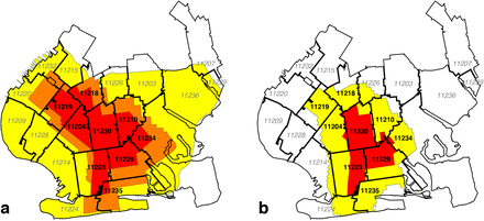
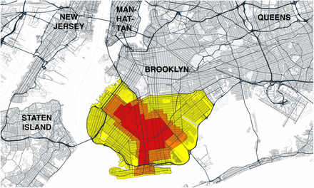
We determined regulatory zone boundaries from detailed maps issued by the office of the Governor of New York [19-21], along with accompanying announcements of updates [17, 18]. Fig. A1 in Appendix A shows the boundaries of the original concentric red, orange, and yellow zones, effective October 9, 2020, overlaid on a street map of the larger New York City area [19]. Figs. 1a and 1b below depict the evolution of the regulatory zone boundaries, overlaid on more detailed street maps of South Brooklyn.
a. Red, Orange and Yellow Zones Effective October 9, 2020 [19], Overlaid on Annotated Map of South Brooklyn. On October 21, the orange zone was redesignated as a yellow zone, while the red zone remained unchanged [20]. b. Revised Boundaries of Red and Yellow Zones as of November 3 [22]. On November 9, the red zone was redesignated as an orange zone [17], and subsequently as a yellow zone on November 18 [18].
Fig. 1a identifies the original red, orange and yellow zones [19]. On October 21, the orange zone was incorporated into the existing yellow zone, while the original red zone boundaries remained unchanged [20]. (This revision is not explicitly shown in the figure.) Fig. 1b shows the contracted red and yellow zones as of November 3 [21]. On November 9, the red zone was redesignated as an orange zone [17], and subsequently as a yellow zone on November 18 [18]. (These last two revisions are likewise not explicitly shown.)
Data Sources: Zip Code Tabulation Area Boundaries
Figs. 2a and 2b superimpose the respective regulatory boundaries of Figs. 1a and 1b on a map of zip code tabulation areas (ZCTAs) in South Brooklyn. The lack of complete congruence between the ZCTA and regulatory boundaries is evident. As discussed below, geographically detailed data on confirmed COVID-19 incidence over time was available only at the ZCTA level. Accordingly, for the purposes of analyzing COVID-19 incidence, we classified any of the nine ZCTAs that even partially overlapped the original red zone as an original red-zone ZCTA. These ZCTAs, indicated in boldface in Fig. 2a, included 11204, 11210, 11218, 11219, 11223, 11229, 11230, 11234, and 11235. The remaining 12 ZCTAs, indicated in italics, were classified as original orange-yellow zone ZCTAs. In Fig. 2b, the same classification of ZCTAs is shown in the map of the contracted regulatory zones effective November 3.
a. Boundaries of the Original October 9 Zones Overlaid on Map of Zip Code Tabulation Areas (ZCTAs). In our calculations of confirmed COVID-19 incidence rates and test positivity rates, we assigned the nine ZCTAs in black boldface to the original red zone, while the remaining 12 ZCTAs in gray italic were assigned to the combined orange and yellow zones. b. Updated Boundaries of the Redrawn November 3 Zones Overlaid on the Same ZCTA Map.
Data Sources: Census Block Groups
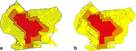
As discussed below, we relied on the Safegraph Social Distancing database [23] to gauge the movements of devices equipped with location-tracking software throughout the greater New York City area. The origin and destination of each device movement in the Social Distancing database are keyed to census block groups (CBGs). Accordingly, we developed a separate correspondence between CBGs and regulatory zones, as shown in Fig. 3a. Relying on QGIS software [24], we determined the geocoordinates the centroids of all CBGs in South Brooklyn based upon their U.S. Census-defined shape files [25]. Using the Stata routine geoinpoly [26], we then assigned each CBG to the regulatory zone polygon in which its centroid was situated. While not explicitly shown in the figure, we used the same procedure to map CBGs into the ZCTA polygons shown in Figs. 2a and b.
a. Boundaries of the Original October 9 Zones Overlaid on Map of Census Block Groups (CBGs). In our calculations of within- and between-zone device movements, we assigned each CBG to the zone containing its geographic centroid. b. Boundaries of the Original October 9 Zones Overlaid on Map of Safegraph Points of Interest (POIs) [27]. Each point corresponds to a POI. Points have different colors depending on the regulatory zone in which they were located.
Data Sources: Points of Interest
We relied upon the SafeGraph Patterns database [27] – a source distinct from the Social Distancing database [23] – to analyze visits of devices to points of interest (POIs) within the regulated area in South Brooklyn. At the broadest level, Safegraph classifies POIs according to the variable top_category, which includes such categories as “Automotive Repair and Maintenance,” “Child Day Care Services,” “Clothing Stores,” “Elementary and Seconday Schools,” “Gasoline Stations,” and “Health and Personal Care Stores.” One of the largest such categories is “Restaurants and Other Eating Places.” Taking advantage of the Safegraph-supplied geocoordinates of each POI, and again relying on the Stata geoinpoly routine [26], we classified each POI as being located in one of the original three regulatory zones. Based upon this classification, we constructed Fig. 3b, which plots the location of every POI as a color-coded point within the original October 9 regulated area.
Data Sources: COVID-19 Incidence and Test Positivity
We relied upon data published by the New York City Department of Health on COVID-19 incidence, measured as the number of confirmed cases per 100,000 population, and COVID-19 test positivity, measured as the percentage of positive tests, broken down by ZCTA and week [28, 29]. Both data sources covered the weeks ending August 8 through November 28, 2020.
Statistical Methods: Paired Point-of-Interest Analysis
We developed a paired point-of-interest (POI) analysis to test whether the regulations imposed by the Governor were in fact enforced and effective. To that end, we focused on device movements into restaurants and other eating places located in the original red zone, where establishments were restricted to takeout/delivery only, and in the original orange zone, where establishments could also offer outdoor dining with up to 4 persons per table [13]. To avoid potentially biased comparisons between local dining patterns in distinct neighborhoods (such as Borough Park in the original red zone and Brighton Beach in the original orange zone, as shown in Fig. 1a), we restricted our comparisons to pairs of nearby eating establishments that straddled the original red-orange border.
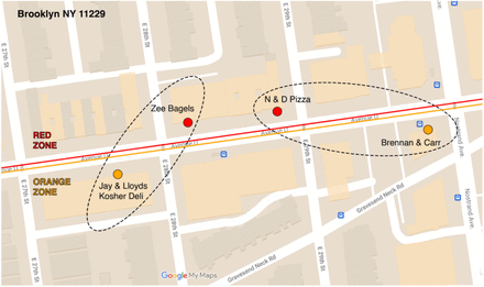
We identified all POIs in the SafeGraph Patterns database [27] with a top_category designated as “Restaurants and Other Eating Places.” Within this restricted dataset, there were 395 POIs in the original red zone and 507 POIs in the original orange zone. (There were also 1,045 POIs in the original yellow zone, but they were not included in our paired POI analysis.) Relying on the Stata program geonear [30], we isolated 219 pairs of red-zone and orange-zone POIs that were nearest neighbors of each other, where the maximum distance between POIs within each pair was 300 meters. The median distance between paired POIs was 130.9 meters, with 25th and 75th percentiles equal to 70.7 and 218.6 meters, respectively. Because a POI on one side of the red-orange boundary could be the nearest neighbor of multiple POIs on the other side, the resulting dataset contained 145 unique red-zone POIs and 114 unique orange-zone POIs. Appendix Fig. A2 maps two such pairs straddling the red-orange boundary running along Avenue U in Brooklyn.
Let I denote the set of all red-zone POIs, with typical element i ∈ I, and let J denote the set of all orange-zone POIs, with typical element j ∈ J. Then our database consists of a subset of 219 unique pairs (i, j) contained within the larger set I × J. For each POI, we relied on the Safegraph Patterns variable visits_by_day to compute the number of visits during each week, starting with the week ending October 1 (designated t = 0) and continuing through the week ending December 3 (t = 9). We thus had 219 paired observations (yRit, yo jt), where yRit represents the number of visits during week t to red-zone POI i, and where yo jt represents the number of visits during week t to orange-zone POI j.
Given these data, we ran the following fixed-effects regression model:

In equation (1), the parameter μ is an overall constant term, βt, θi. and ϕj are fixed-effect parameters, and ϵijt are independently distributed spherical error terms. Within this fixed-effects framework, only the contrasts βt − β0 (t = 1,…,9) can be identified. If the regulations imposed by the Governor were in fact enforced and effective, then we would expect the estimated parameters βt to be negative.
Statistical Methods: Geospatial Analysis
Movements to specific points of interest such as restaurants, auto repair shops and daycare centers are part of a larger set of movements to destinations that include private residences and workplaces. We sought to determine how these more general mobility patterns related to the evolution of COVID-19 incidence, particularly during the period from the second half of October to the end of November, when cases of the disease were increasing throughout the regulated area in South Brooklyn. To that end, we developed a geospatial model relating COVID-19 incidence to general device movements. The central feature of this model was that the incidence of the disease in a particular ZCTA during a particular week was related to the incidence in all ZCTAs during the prior week. Moreover, the influence of one ZCTA on another was determined by the volume of device traffic between the two. The details of our model and its implementation are given in Appendix B.
Our model relied on two types of data: COVID-19 incidence and device movements. Because our data on COVID-19 incidence were based upon ZCTAs, we classified device movements between ZCTAs as well. Relying on data published by the New York City Department of Health [28], we constructed a data series {ykt} of the incidence of confirmed COVID-19 cases per 100,000 population in ZCTA k during week t, where k = 1,…,21 indexes the 21 ZCTAs within the regulated area in Fig. 2, and where t = 1,…,7 indexes the 7-week period running from the week ending October 17 through the week ending November 28. Relying upon the variables origin_census_block_group and destination_cbgs in the Safegraph Social Distancing database [23], we constructed a data series {nkℓt} of counts of device movements from ZCTA k into ZCTA ℓ during week t. The counts nkkt, which represented the number of device movements staying within ZCTA k during week t, included those devices homed the ZCTA that made no movements. While we also observed device movements beyond the 21-ZCTA regulated area, as well as movements into the regulated area from outside, we focused sharply on the regulated area in order to ascertain how the traffic between local ZCTAs influenced the dynamics of COVID-19 transmission.
Based upon our underlying data on device movements, we let Vt be a 21×21 square matrix with typical element vkℓt measuring the proportion of all devices originating in ZCTA k that moved into ZCTA ℓ during week t. The elements of each row of Vt sum to 1. Likewise referring to week t, we let Wt be a 21×21 square matrix with typical element wkℓt measuring the fraction of all devices with a destination in ZCTA ℓ that originated in ZCTA k. The elements of each column of Wt sum to 1. Let Yt denote a 21×1 column vector with elements ykt. We let Yt+1 represent the corresponding vector of incidence rates one week later, while ηt+1 is a contemporaneous vector of error terms. Under the strong assumption of homogeneous mixing, our geospatial model yields:

In equation (2), the unknown parameter α, to be estimated from the data, represents the contemporaneous reproductive number for COVID-19 transmission throughout the entire regulated area for the 7-week time period under study.
Relaxing the assumption of homogeneous mixing, we assumed instead that movements by individuals who remained within their home ZCTA could have a different influence on COVID incidence. To capture the effect of these within-zone device movements, we defined Dt = diag(VtWt′) as the K × K square matrix with the same diagonal elements as VtWt′ but zero off-diagonal elements, and the introduced the additional regressor DtYt into our model. We further assumed that movements to and from certain high-risk ZCTAs could exert more influence than movements to and from the remaining lower-risk ZCTAs. To capture such differences in transmission efficiency, we partitioned the set of ZCTAs into two mutually exclusive subsets, L and H, representing the low- and high-transmission ZCTAs respectively. Defining the K × K square matrix Xt = VtWt′ − Dt, we then partitioned Xt vertically into two matrices, XtL and XtH. Similarly, we partitioned the column vector Yt horizontally into two vectors: YtL and YtH. Then equation (3) becomes:

The unknown parameters α0, α1, and α2, respectively, represent the reproductive numbers for movements within-ZCTAs, movements to and from low-risk ZCTAs, and movements to and from high-risk ZCTAs.
Based upon our examination of the trends in inter-ZCTA mobility, as detailed in the Results section, we identified five high-mobility ZCTAs along the southern boundary of the 21-ZCTA area as the most likely elements of the high-risk set H. We estimated the models of equations (2) and (3) with weighted least squares, where the weights were the ZCTA populations derived from the New York City Department of Health data [28].
Results
COVID-19 Incidence and Test Positivity
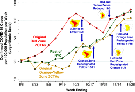
Fig. 4 below plots the incidence of confirmed cases of COVID-19 per 100,000 population in the original red zone, the combined orange and yellow zones, and in the rest of New York City during the weeks ending August 8 through November 28. Also noted in the plot are the dates of Governor’s five successive regulatory actions, starting with the imposition of the original three concentric zones, effective October 9.
The data points represent population-weighted rates, derived from ZCTA-specific weekly COVID-19 incidence as reported by the NYC Department of Health [28], and aggregated according to the scheme in Fig. 2a. Superimposed on the graphic are the dates of five successive regulatory actions: (i) establishment of the original three zones on October 9 [7, 19]; (ii) redesignation of the original orange zone as yellow on October 21 [14]; (iii) reduction in the size of the red and orange zones on November 3 [17, 22]; (iv) redesignation of the reduced red zone as orange on November 9 [17]; and (v) redesignation of the reduced orange zone as yellow on November 18 [18].
After rising during August and September, COVID-19 incidence in the ZCTAs comprising the original red zone started to decline during the week ending October 10, a time period that included five days before the regulatory scheme took effective. COVID-19 incidence in the red zone continued to decline through the week ending October 31, but then began to rebound. By contrast, COVID-19 incidence in the original orange and yellow zones, as well as the rest of New York City, had been increasing since at least mid-September, and reached approximately the same level as the original red zone by November. By November 21, all three series had exceeded the threshold of 100 cases per 100,000 population per week.
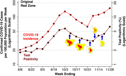
Fig. 5 below focuses sharply on the original red zone. The incidence of confirmed COVID-19 cases per 100,000 population, measured on the left-hand vertical scale, is reproduced from Fig. 4. Superimposed on this time series is the test positivity rate, measured on the right-hand vertical scale. As in Fig. 4, the dates when each of the five successive regulatory actions went into effect are noted.
As in Fig. 4, the data points represent population-weighted rates, derived from ZCTA-specific weekly COVID-19 incidence [28] and test positivity [29] among the ZCTAs identified as covering the red zone in Fig. 2a. As in Fig. 4, the blue arrows show the dates on which the five successive regulatory actions went into effect, while the accompanying maps show the corresponding zone changes.
The variable vertical gap between the two timeseries in Fig. 5 corresponds to the changing testing rate for COVID-19. Thus, the testing rate per 1,000 population progressively increased from 11.33 during the week ending August 8 to 17.15 during the week ending September 12, and then further increased to 24.61 by the week ending October 10. By the weeks ending November 7, 14 and 21, respectively, the testing rates had reached 33.99, 27.88, and 28.20 per 1,000 population.
Because the red-zone ZCTAs in Fig. 2a only approximate the precise boundaries of the original red zone, the estimated test positivity rates plotted in Fig. 5 represent only approximations to the positivity rates that were relied upon by state regulators. Still, during the week ending November 7, there is a striking divergence between the declining test positivity rate and the concurrently rising incidence rate. This finding suggests that regulators, relying on the trend in a test positivity rate that was biased downward by enhanced testing, relaxed restrictions when in fact the incidence of the disease was rising.
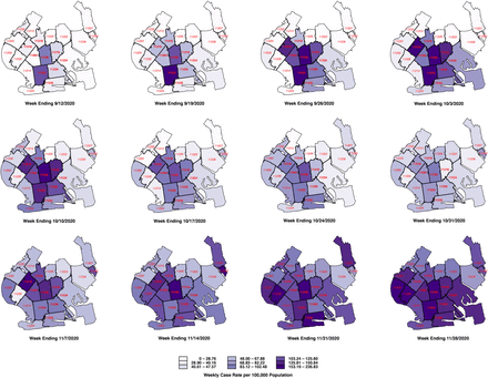
Fig. 6 below tracks the detailed evolution of COVID-19 incidence in each of the 21 ZCTAs identified in Fig. 2 during the weeks ending September 12 through November 28. The first row, covering the weeks ending September 12 through October 3, shows increasing disease incidence in the central ZCTAs covering what would ultimately be designated as the red zone. In the second row, covering the weeks ending October 10 – 31, the incidence of COVID-19 was declining in the central ZCTAs but increasing in the peripheral ZCTAs, particularly along the southern and western borders of the South Brooklyn region. In the third row, covering the weeks ending November 7 – 28, COVID-19 incidence continued to rise in these peripheral ZCTAs, while resuming its upward trend in the central ZCTAs. By November 28, the original central zone of high-incidence ZCTAs is no longer distinguishable.
Visits to Restaurants: Paired POI Analysis
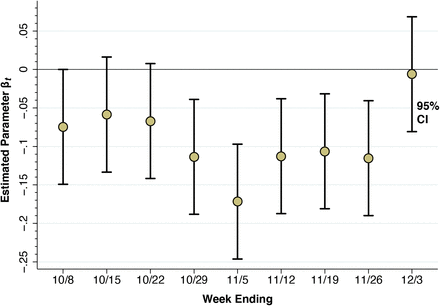
Fig. 7 below shows the results of our paired POI analysis of visits to restaurants and other eating places. The estimate of β1 = –0.075 for the week ending October 8 is negative and significantly different from zero in a two-sided test (p = 0.0497). That is, visits to restaurants in the red zone had already declined by 7.5% relative to those in the orange zone during the week before the regulatory scheme went into effect. While the individual estimates of β2 = –0.059 and β3 = –0.067 are not significantly different from zero, the overall downward trend is evident by the weeks ending October 29 and November 5, where β4 = –0.114 (p = 0.003) and β5 = –0.172 (p < 0.001). Thereafter, as the red zone is reduced by half (effective November 3), then reclassified as orange (effective November 9), and then reclassified as yellow (November 18), the estimates of βt begin to rebound. By the week ending December 3, the estimate β9 = –0.006 is no longer significantly different from zero (p = 0.87).
Each point represents an estimate of the contrast βt – β0 for t=1,…,9, where t = 0 represents the week ending 10/1/20 as a reference category. The error bars surrounding each point represent 95% confidence intervals.
Movements Within and Between Regulatory Zones
The results of our paired analysis of restaurants and other eating places, as shown in Fig. 7, narrowly reflect trips to a specific category of establishments that were subject to specific regulatory controls. They do not necessarily capture broader trends in unregulated movements of individuals within and between zones.
Appendix Table A1 delineates movements of devices within and between zones, as well as movements outside the regulated area, during the three weeks before and the subsequent three weeks after the regulations went into effect on October 9. Comparison of the movement matrices during the two time periods (September 18 through October 8, October 9 through October 29) indicates that overall movement patterns remained stable. Among devices homed in the original red zone, only 57–58% of movements were confined to the red zone, while 23–24% of movements were to destinations outside the regulated area entirely. The same pattern is evident in the movements of devices homed in the original orange and yellow zones as well.
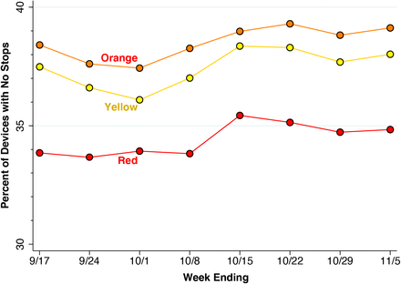
The overall stability of within-zone movements seen in Appendix Table A1 could still obscure significant changes in mobility, particularly in the proportion of devices that made few if any movements. Appendix Fig. A2, however, shows that the percentage of devices that made no movements at all rose only by 1 to 2 percentage points.
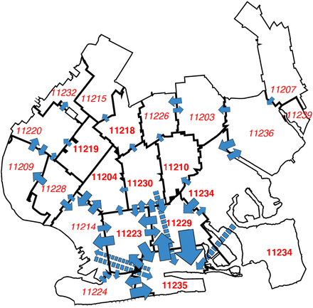
Fig. 8 tracks more detailed movements between ZCTAs, rather than between regulatory zones, during October 25 through November 28. This time period corresponds to the final five weekly maps in Fig. 6, when COVID-19 was increasing both in the central ZCTAs and the peripheral ZCTAs along the southern and western edges of the regulated area. The width of each arrow corresponds to the magnitude of the flow between ZCTAs. The figure demonstrates that dominant inter-ZCTA movements were between four red-zone ZCTAs (11229, 11223, 11230, 11204) and three orange- and yellow-zone ZCTAs (11235, 11224, 11214). Moreover, there was significant device traffic between these southern ZCTAs and other peripheral ZCTAs to the west of the regulated area.
The width of each blue arrow is proportional to the number of device movements in the Safegraph cohort. The longer arrows with dashed lines represent transits between noncontiguous ZCTAs. The number of device movements ranged from 21,139 (corresponding to the transit 11229 → 11235) to 5,002 (corresponding to 11214 → 11224). Transits between ZCTAs with fewer than 5,000 movements are not shown. The transits captured by the arrows comprised 44.5% of all device movements between ZCTAs.
Influence of High-Risk ZCTAs: Geospatial Analysis
Based upon our findings in Fig. 8, we identified five high-mobility ZCTAs as potential candidates for high-risk transmission to other surrounding ZCTAs in the area: 11223, 11229, 11235, 11224. and 11214. As seen in Fig. 2a, two of the areas, 11224 and 11214, were not in the original red zone, while another area, 11235, was excluded from the red zone when the zones were contracted on November 3.
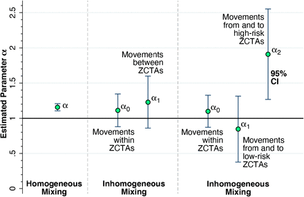
Fig. 9 shows the results of our geospatial analysis. At the left end of the graphic, in a model of homogeneous mixing with a single, uniform parameter for the entire regulated area (equation 2 in the Methods section), the estimated reproductive number was α = 1.157 with 95% confidence interval [1.106, 1.208]. The middle panel shows the results of a two-parameter model of inhomogeneous mixing that allows for movements within ZCTAs to have a different effect on COVID-19 transmission (equivalent to equation 3 with the constraint α1 = α2). Both parameters α0 for within-ZCTA movements and α1 for between-ZCTA movements are in the range of 1.1– 1.2, though they are too imprecise to be distinguishable from each other or from 1.0.
Left: Estimate of a uniform parameter α = 1.157 with 95% confidence interval [1.106, 1.208] for the entire regulated region, based upon the assumption of homogeneous mixing. The estimate of α is significantly different from 1.0 (2-sided F-test, p < 0.001). Middle: Estimates of the parameters α0 for the effect of movements within ZCTAs and α1for between-ZCTA movements, based upon a two-parameter model of inhomogeneous mixing. Right: Estimates of the parameters α0 for the effect of movements within ZCTAs, α1for the effect of movements from and to low-risk ZCTAs, and α2for the effect of movements from and to high-risk ZCTAs 11223, 11229, 11235, 11224. and 11214, based upon a three-parameter model of inhomogeneous mixing. The estimated parameter α2 = 1.910 with 95% confidence interval [1.268, 2.552] is significantly different from 1.0 (2-sided F-test, p = 0.012).
The right-hand panel of Fig. 9 shows the estimates of a three-parameter model with inhomogeneous mixing (equation 3), which further distinguishes between the effects of device traffic in low- and high-risk ZCTAs. The estimate of α0 is imprecise but consistent with the findings in the two-parameter model in the middle panel. The estimate of α1 for low-risk ZCTAs is likewise imprecise, but points to a reproductive number less than 1.0. By contrast, the estimate of α2 for the effect of device traffic from and to high-risk ZCTAs gave a reproductive number of 1.910 with 95% confidence interval [1.268, 2.552]. Moreover, the estimate of α2 was significantly different from α0 (p = 0.045) and α1(p = 0.012) based upon 2-sided F-tests.
Discussion
While it may be tempting to attribute the temporary decline in COVID-19 incidence in the red zone to the Governor’s regulatory scheme, the data in Fig. 4 suggest that the incidence of the disease was in fact declining during the week before any controls went into effect on October In view of the approximate 5-day incubation period between initial infection and the subsequent development of symptoms warranting testing [31], the incidence of the disease was likely to have been declining even earlier. Our analysis in Fig. 7 of pairs of eating places straddling the red-orange border similarly indicates that device visits to establishments on the red side of border were already dropping more rapidly during the week ending October 8. These findings do not foreclose a causal impact of the Governor’s regulatory scheme, but they do suggest that other factors were in play. Aside from voluntary action on the part of the red zone’s residents, the Mayor’s threats to impose controls in five key zip codes in South Brooklyn, voiced as early as September 29 [11], may have contributed to the outcome.
Still, our analysis of paired eating places suggests that the Governor’s regulatory scheme did something. The red-zone rules allowed for only takeout and delivery, while the less stringent orange-zone rules allowed for outdoor dining as well [13]. By the week ending November 5, device visits to establishments on the red side of the red-orange border were down 17.2 percent more than their counterparts on the orange side (Fig. 7).
Even if the Governor’s regulatory scheme was at least partly responsible for retarding the surge of COVID-19 in the central red zone during the last three weeks of October, it is evident that the program’s success was short-lived. As Figs. 4 and 6 show, the decline in COVID-19 incidence during October was ultimately reversed by a wave of increasing disease incidence that had similarly overtaken the surrounding orange and yellow zones by the end of November. These observations beg the question: Why did the Governor’s scheme ultimately fail?
Overreliance on Test Positivity
One clue is offered by the striking discordance between the upward surge of disease incidence and the continuing downward trend in test positivity during the week ending November 9, as shown in Fig. 5. The underlying explanation for the discordance of these two trends was the continuing expansion of testing, which diluted the rising incidence with an abundance of negative test results. It was just at this juncture that regulators, overly fixated on the test positivity rate, cut the size of the red zone in half and then converted the red zone to orange.
Access Controls Versus Restrictions on Mobility
The regulations imposed in the Governor’s concentric regulatory zones were fundamentally controls on access – to eating places, to school buildings, to houses of worship, and to large meetings. They differ from the classic remedy of containment, which entails restrictions not just on access, but also on overall mobility [32-34]. Although restricting access to some critical locations is indeed likely to reduce disease propagation [35, 36], the question here is whether focused controls on access alone were sufficient to alter the underlying mobility patterns that served as the template for a surge in COVID-19 cases. While some have cited increasing indoor activity with the arrival of colder fall weather [37] or a trend toward large family gatherings as the Thanksgiving holiday approached [38], we have in mind more fundamental, well-established contact networks.
The hypothesis that the underlying mobility patterns within the regulated area in South Brooklyn were insufficiently altered by the Governor’s regulatory controls on access is supported by the stability of the interzone movement matrices before and after the promulgation of the regulatory scheme (Appendix Table A1) as well as absence of any significant change in the proportion of devices with no movements (Appendix Fig. A3).
High-Risk ZCTAs as Drivers of the Local COVID-19 Surge
One interpretation of the trends in Fig. 4 is that the surge in COVID-19 cases that ultimately overran South Brooklyn was a citywide phenomenon, and that the incidence of the disease was simply increasingly uniformly across all ZCTAs. The patterns of declining and rising COVID-19 incidence seen in Fig. 6 go against this interpretation. Once the incidence reached a low point around the week ending October 17, the subsequent increase was driven by ZCTAs along the southern and western borders of the area. During the resurgence of COVID-19 incidence, mobility patterns were hardly uniform, as shown in Fig. 8. In fact, the geospatial analysis demonstrates that five high-mobility ZCTAs – of which only two were part of the original red zone – were the main drivers of the resurgence in COVID-19, with a reproductive number close to 2, as shown in Fig. 9.
A Natural Experiment Gone Awry
Our study is fundamentally observational. We did not analyze a macro-experiment in which various communities were randomly assigned to different regulatory controls or no intervention at all [39]. Still, our setup has many of the features of a natural experiment gone awry. The Governor’s announcement of a new regulatory regime on October 6, to become effective by October 9, could reasonably be characterized as an abrupt shock [7]. In view of the Mayor’s earlier threats to impose controls on certain zip codes in South Brooklyn [11], however, it could hardly be considered an unanticipated shock. The implementation of distinct regulations within each of three concentric regulatory zones provided natural intervention and control groups, and the results of our paired restaurant analysis (Fig. 7) suggest that the regulations were effective and enforced. While the restaurants stayed put, however, Appendix Table A1 and Fig. 8 show that the experimental participants crossed over from one zone to another. Midway through the intervention, on November 9, the Governor cut the regulatory zones in half [17], thereby contaminating the original experimental assignments.
Despite these flaws in design, we can nonetheless draw some reasonable inferences from the accumulated evidence. First, test positivity as a real-time indicator of regulatory effectiveness is fraught with potential biases [40, 41]. Here, the Governor and his advisors may have been led astray by a test positivity rate that was kept misleadingly close to 3 percent by an endogenous increase in testing among COVID-negative persons (Fig. 5).
Second, while restrictions on access to eating establishments and other high-risk venues may be narrowly effective (Fig. 7), they do not prevent people from moving around (Appendix Table A1, Fig. 8). In highly populous areas such as South Brooklyn, a halfway strategy of concentric regulatory zones based solely on access restrictions may be no substitute for the classic approach of concentric containment/quarantine areas [6, 34].
Third, overreliance on static rather than dynamic measures of disease burden to draw the boundaries of regulatory zones can prove to be highly misleading. Our geospatial analysis of COVID-19 incidence, entailing a dynamic model of COVID-19 incidence across 21 zip code tabulation areas (Fig. 9), identified five high-mobility ZCTAs where the reproductive number approached 2. Two of the five were not in the original red zone. Concentric zones may appear to be an effective regulatory approach in principle, but only if the boundaries are drawn correctly.
Data Availability
All programs and data are available at OSF Project "Brooklyn Concentric Zones 2020," https://osf.io/rquyx/
Appendix A
The original three zones, color-coded red, orange, and yellow, went into effect on October 9, 2020 [19]. On October 21, the orange zone was redesignated as a yellow zone, while the red zone remained unchanged [20]. The entire regulated area, situated in South Brooklyn, was bounded along the north by New York State Route 27, originating in the northwest at exit 24 of Interstate I-278, with stretches along Prospect Parkway, Caton Avenue, Linden Boulevard, and then further bounded by Pennsylvania Avenue at the northeast end.
Avenue U bounds the red zone to the north and the orange zone to the south. Zee Bagels in the red zone was paired with Jay & Lloyds Kosher Deli (now permanently closed) in the orange zone. The distance between the two POIs was 61 meters. Similarly, N & D Pizza in the red zone was paired with Brennan & Carr in the orange zone. The distance between the two POIs was 92 meters.
Distribution of Device Movements Three Weeks Before and Three Weeks After the Establishment of Concentric Regulatory Zones on October 9, 2020 a
Census block groups (CBGs) were mapped into regulatory zones in accordance with the scheme in Fig. 3a in the main manuscript. In each CBG during each day, we determined the number of devices making no stops, derived from the variable bucketed_distance_traveled, and the total number of devices, derived from the variable device_count, as recorded in the Safegraph social distancing database [23].
Appendix B
Geospatial Model
Homogeneous Mixing
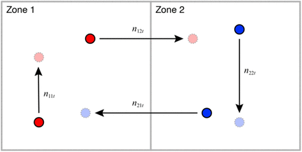
An area consists of a fixed number of geographically contiguous zones, indexed k = 1,…,K. A total of Nk > 0 individuals reside in zone k2 At the start of each time period t = 1,…,T, each individual residing in each zone k either remains within her zone of residence or temporarily moves to any one of the other K − 1 zones. At the end of time period t and before the start of time period t + 1, the individual returns home to zone k. Let nkℓt ≥ 0 denote the number of movements of individuals from zone k into zone ℓ during time period t. Fig. B1 illustrates the types of movements within and between zones in a two-zone area at time t. All individuals’ movements are accounted for, so that ∑ℓ nkℓt = Nk. Note that the number of individuals temporarily situated in zone ℓ during time period t is Mℓt = ∑k nkℓt ≥ 0.
Individuals represented by red circles reside in Zone 1 and individuals represented by blue circles reside in Zone 2. During time period t, n11t residents of Zone 1 stay within their home zone, while n12t residents of Zone 1 temporarily move to Zone 2. Similarly, n22t residents of Zone 2 stay within their home zone, while n21t residents of Zone 2 temporarily move to Zone 1. During period t, a total of M2t = n12t + n22t individuals are temporarily situated in Zone 2. Of these M2t individuals, the proportions originating from Zones 1 and 2, respectively, are w12t = n12t/M2t and w22t = n22t/M2t. A total of N1 = n11t + n12t individuals permanently reside in Zone 1. Of these N1 individuals, the proportions moving to Zones 1 and 2, respectively, are v11t = n11t/N1 and v12t = n12t/N1.
An infectious disease is spread though contact between individuals temporarily situated within the same zone. The disease has a latency, an incubation interval, and a duration of infectivity of exactly one time period. That is, an individual infected through contact with an infectious person during time period t – 1 is diagnosed with the disease and herself becomes infectious to others only during time period t.
We keep track of the disease according to individuals’ zone of residence k and date of diagnosis t. We let ykt ≥ 0 denote the fraction of residents of zone k who were diagnosed during time period t. We refer to these quantities as the incidence of the disease. The initial incidence yk1 thus represents the fraction of individuals residing in zone k who are diagnosed with the disease and are infectious to others during time period t = 1. Except for these initially infectious individuals, the remainder of the population is susceptible to infection. We assume yk1 ≪ 1, so that the initial proportion of susceptible individuals in each zone k is approximately equal to 1.
We further assume homogeneous mixing of infectious and susceptible individuals. Let wkℓt= nkℓt/Mℓt represent the fraction of all individuals temporarily situated in zone ℓ during time period t who reside in zone k. Then the conditional probability of infection of a randomly selected, susceptible person temporarily situated in zone ℓ during time period t is pℓt = α ∑rwrℓtyrt, where α > 0 is the reproductive number, an indicator of the efficiency of transmission. (In this expression, we have used the summation index r for zones of residence, rather than k.)
Now consider a randomly selected, susceptible individual residing in zone k. The probability that this individual will be temporarily situated in zone ℓ during time period t is vkℓt = nkℓt/Nk. Hence, the unconditional probability that this resident of zone k will be infected via contact with an infectious person during time period t is ∑ℓvkℓtpℓt or equivalently, ∑ℓ(vkℓt) (α∑r wrℓtyrt). We thus have the dynamic equation of motion of the incidence of infection in each zone in each time period:

Equation (B1) is a linear system of difference equations, in which the incidence of new cases yk,t+1 diagnosed during time period t + 1 among residents of zone k depends on the incidence {yrt} of cases previously diagnosed at time t in all zones r = 1,…,K.
It will be useful to convert equation (B1) into matrix notation. For each time period t, let Vt be the K × K square matrix with typical element vkℓt= nkℓt/Nℓt, which, as noted above, represents the fraction of all residents of zone k who temporarily move to zone ℓ during time period t. The elements in the rows of Vt sum to 1. Let Wt be the K × K square matrix with typical element wkℓt= nkℓt/Mℓt, which, as noted above, represents the fraction of all individuals temporarily situated in zone ℓ during time period t who reside in zone k. The elements of the columns of Wt sum to 1. Finally, let Yt denote the K × 1 column vector (y1t … ykt)′. Then our dynamic model can be represented in matrix form as:

In equation (B2), all the elements of the K × 1 column vector Vt Wt′ Yt are multiplied by the same scalar parameter α. If we already have data on the movements {nkℓt} between zones and data on the incidence {ykt} of the disease, then the matrices Vt and Wt and the vectors Yt are likewise observed quantities, and thus we can estimate the reproductive number α as the only unknown parameter.
Inhomogeneous Mixing
We consider two modifications of equation (B2) to capture inhomogeneous mixing [42]. First, movements of individuals who remain within their zone of residence may have a lower reproductive number α0. Second, movements of individuals who reside in or enter certain high-risk zones may have a higher reproductive number α1. All other movements are assumed to have the same reproductive number α2.
To capture within-zone movements, let Dt = diag(VtWt′) denote the K × K square matrix with the same diagonal elements as VtWt′ but zero off-diagonal elements. Define the K × K square matrix Xt = VtWt′ − Dt, that is, the matrix VtWt′ with its diagonal elements set to 0. Then our model becomes:

To further capture differences in transmission efficiency between zones, we partition the set of zones into two nonempty subsets, L and H, representing the low- and high-transmission zones, respectively. The former has KL elements and the latter has KH = K − KL elements. We assume all zones in L have the same reproductive number α1, while all zones in H have reproductive number α2. Partition the square K × K matrix Xt vertically into two matrices: a K × KL matrix XtL, and a K × KH matrix XtH. Similarly, partition the column vector Yt horizontally into two vectors: YtL and YtH. Then equation (B3) becomes:

Model Implementation
The area under study consists of K = 21 ZCTAs situated in South Brooklyn, as shown in Fig. 2 of the main text. We focus on the 7-week period running from the week ending October 17 through the week ending November 28, that is, the last 7 images in Fig. 6 in the main text. We derive the incidence ykt for k = 1,…,21 and t = 1,…,7 from confirmed COVID-19 cases per 100,000 population, as reported by the New York City Department of Health [28].
We relied upon the variables variables origin_census_block_group and destination_cbgs in the Safegraph Social Distancing database [23] to identify all device movements between census block groups (CBGs) within the 21-ZCTA area. Assigning each CBG to a specific ZCTA based upon the location of its centroid, we were thus able to compile data nkℓt, representing the number of device movements from ZCTA k to ZCTA ℓ during week t. We further relied on the variable bucketed_distance_traveled to count the number of devices that made no movements in each ZCTA k during each week t, and then added these counts to the within-ZCTA movements nkkt. While we also observed device movements beyond the 21-ZCTA regulated area, as well as movements into the regulated area from outside, we focused sharply on the regulated area in order to ascertain how the traffic between local ZCTAs influenced the dynamics of COVID-19 transmission.
Given the incidence data {ykt} and movement counts {nkℓt}, we estimated the models of equations (B2), (B3) and (B4) by weighted least squares, where the weights were the populations of each ZCTA.
Footnotes
↵† This study relies exclusively on publicly available data that contain no individual identifiers. The author has no competing interests and no funding sources to declare. This article represents the sole opinion of its author and does not necessarily represent the opinions of the Massachusetts Institute of Technology, Eisner Health, or any other organization. Supporting programs and data have been posted at https://osf.io/rquyx/.


