
Summary
Historically, Sir Isaac Newton, with a great perspective of geometry, analysed an elliptical orbit derived from Kepler’s primary astronomical data analysis, and the sir elicited the theory of gravitation. Namely, secondary analysis with geometry was an essential step in physics. Then, with a geometrical perspective, a re-analysis of a chart in the figure is also practical in biomedicine? Nowadays, some image-checking AI detects research misconduct but not for useful, latent findings1. Taking our concept one step further, we focused on a geometrical meaning of the confidence interval error bar. As an exploratory data analysis know-how in a figure of meta-regression analysis, we conceived a method based on recognising geometrical patterns (layered hyperbolic shapes) suspected of overlapping subgroups. Here we show the result that we applied our ideas to the traveller’s thrombosis (economy class syndrome) and coronavirus disease 2019 (COVID-19), both of which were suspected of having overlooked information from many controversy2–21. Our analysis implied two S-curve types of risk increasing during a flight in the traveller’s thrombosis. Also, our analysis demonstrated overlooked cyclic patterns on the onset of thrombosis. This result suggests a strong relationship between travel and starting oral contraceptives (e.g., honeymoon and starting birth control oral contraceptives), which means that risk diversification might allow more safe use of oral contraceptives. In the COVID-19, our analysis demonstrated unrecognised scatter plot patterns on cardiac biomarkers, which may serve studies for pathophysiology in COVID-19 patients. Regarding the above findings, pattern recognition of hyperbolic shapes can contribute to a significant discovery in data mining.
Main text
Recently, software improvements have allowed us to make a beautiful chart, but the understanding chart is required22. As readers of a scientific article, we took the idea of “reading a chart carefully” one step further and made a question that “something new exploratory data analysis (data mining) method assisted us to find important knowledge from previously published figures?”. In addition, although statistics based on probability theory have applied the mathematical method to biomedicine (e.g., P-value), we turned our attention to the viewpoint of geometry regarding its importance in history.
Subsequently, we were interested in a research field, traveller’s thrombosis, in which many controversies seemed to be associated with something overlooked (Supplementary discussion 1: history of traveller’s thrombosis). In the literature review, we focused on a figure that showed a result of meta- regression analysis (Chandra et al., Ann Intern Med. 2009;151(3):180-90., Figure 3)7. In this figure, we saw a geometrical shape (layered hyperbolic shapes) that seemed to be formed by overlapping two subgroups (Fig. 1 a-d, Fig. 2, a).

a, A two-way cross-tabulation (contingency table) for calculating an odds ratio (OR). b, Calculation of OR and its 95% confidence interval. c, Histogram of the data following a binomial distribution and a plot of the inverse values of the square roots. d, The mathematical formulas for the hyperbolic shape. Note that the OR is not logarithmic, and only the length of the error bar is logarithmic (see the upper left position of panel d).

a, Data review and meta-regression analysis using the same method as Chandra et al. Ann Intern Med. 2009; 151(3):180-190. Figure 37. We added information from original studies and our hypothesis to the previously published form, such as latent distribution. The original figure has been shown on the American College of Physicians website, which links to PubMed○R (https://pubmed.ncbi.nlm.nih.gov/19581633/). From Chandra D, Parisini E, Mozaffarian D. Meta-analysis: travel and risk for venous thromboembolism. Ann Intern Med. 2009 Aug 4;151(3):180-90. doi: 10.7326/0003- 4819-151-3-200908040-00129. Epub 2009 Jul 6. © 2009 American College of Physicians. Adapted with permission. b, grouping the data and hyperbolic shape fitting. c, Onsets of thrombosis after travel reported by Cannegieter et al25. This figure was re-used and re-drawn from Cannegieter et al. Travel-related venous thrombosis: results from a large population-based case-control study (MEGA study). PLoS Med. 2006; 3(8):e307. Figure 1. https://www.ncbi.nlm.nih.gov/labs/pmc/articles/PMC1551914/figure/pmed-0030307-g001/ Copyright © 2006 Cannegieter et al. Creative Commons Attribution License. In 2006, the Creative Commons Attribution 2.0 Generic, License was available. https://creativecommons.org/licenses/by/2.0/ d, Applying the damped wave function to the data shown in panel c. We decided that the data from Martinelli et al.23 and Cannegieter et al.25 should be excluded, and the odds ratio from Parkin et al.24 may decrease (see Methods). At 2 hours point, Chandra et al.7 did not use available data (panel a). On the original regression line, Chandra et al.7 might conduct a meta-regression analysis reversing the front head and the front side of the cross-tabulation. Compering panels c and d helps us understand that using a three-dimensional graph disrupts our recognition.

a, A figure shows the relationship between the severe and non-severe groups reported by Matsushita et al.33, which shows age difference on the horizontal axis and odds ratio (OR) or hazard ratio of hypertension on the vertical axis. To evaluate potential confounding for relative risk by age, Matsushita et al. conducted meta-regression analyses based on the assumption that there was the possibility of confounding by age in the case that the study with a larger age difference has a higher relative risk33. b, Diabetes. c, Cardiovascular disease (CVD). d-f, Comparisons of error bars, which show 95% confidence interval (C.I.) s. It corresponds to the upper figure. g-i, Hyperbolic patterns were fitted to the OR and the 95% confidence limit of the OR. In the panel i, a hyperbolic shape could not be fitted due to the considerable data variation, likely due to the inconsistency of the term “CVD” (see Methods). The numbers marked to each point are the same as the numbers shown in the original figure. The sources of each data are shown in Methods. This figure was re-used from Matsushita et al. Glob Heart. 2020; 15(1):64. Figure 5. https://www.ncbi.nlm.nih.gov/labs/pmc/articles/PMC7546112/figure/F5/ Copyright © 2020 The Authors. Creative Commons Attribution 4.0 International License (CC-BY 4.0) https://creativecommons.org/licenses/by/4.0/
Through those trains of thought, we conceived a methodological process based on our basic concept that approaching biomedical data from geometry was essential for exploratory data analysis. As know-how, here we propose a kind of pattern recognition, which is searching for layered hyperbolic patterns in a figure showing a result of meta-regression analysis.
To validate our ideas, we worked on consecutive exploratory data analyses, such as Analysis 1 (1A, 1B) and Analysis 2, setting a working hypothesis that the shape formed by multiple subgroups for (overall study framework is shown in Extended Data Fig. 1).
Numerical Experiment
Considering theoretical consideration and numerical experiment, we constructed three mathematical formulas for fitting hyperbolic patterns to data (see Fig. 1 & Methods). The numerical experiment indicated that a U-shaped curve formed by the end of the confidence limit could be approximated by a parabola (Fig. 1, c).
Analysis 1A (dataset: Chandra et al.)7
To assess eligibility for regression analysis, we reviewed a dataset, which was consisted of four study data gathered by Chandra et al.7 for meta-regression analysis (Martinelli et al., 2003; Parkin et al., 2006; Cannegieter et al., 2006; Kuipers et al., 2007)23–26. In this assessment, two study data (Martinelli et al., 2003; Cannegieter et al., 2006)23, 25 were judged inappropriate and excluded. Also, the odds ratio reported by Parkin et al.24 was suspected to be affected by a miscalculation, but qualitatively, it could only be used (see Extended Data Fig. 1 & Methods).
In a part of the original dataset (Parkin et al., 2006 & Kuipers et al., 2007)24, 26, layered hyperbolic patterns appeared and applied regression analysis with the above three formulas. The inflexion points of the S- curves (centres of distributions) were 7.1 hours and 11.8 hours, respectively (Fig. 2, b).
Notably, we observed an overlooked cyclic pattern in the figure reported by Cannegieter et al25 during the data review process. The cycle was 27.4 days (Extended Data Fig. 2). They did not mention this wave pattern, and this notable oversight allowed to be accounted for by an inappropriate 3-dimensional graph that disrupted human visual recognition (Fig. 2, c, d, & Extended Data Fig. 2).
Analysis 1B (dataset: Philbrick et al.)4
Considering that only a few data were available for the first analysis, to validate the first result, we performed a similar analysis using another dataset, which was gathered by Philbrick et al. for a systematic review. As a preparation, we conducted a data review to confirm eligibility for regression analysis (see Extended Data Fig. 1). Then, only S-curves were applied because the dataset did not contain risk ratio data, and hyperbolic shapes could not be fitted (for the details, see Methods). In this analysis, we found that two inflexion points of S-curves were divided similarly to the first analysis (< 10 hours, > 10 hours) in the stratified datasets by pulmonary embolism (PE) and deep vein thrombosis (DVT). The inflexion point of PE was about 9.2 hours, and the point of DVT was about 12.1 hours, respectively (Extended Data Fig. 3).
Additionally, we found that unrecognised periodic pattern in the data reported by Clérel and Caillard27 during the data review, which was suspected to be the effect of circadian rhythm (Extended Data Fig. 4). We also found a post-travel cyclic pattern in the Kelman et al.28 same cases as Cannegieter et al25. The wave was less clear than the wave observed in the data reported by Cannegieter et al25. In the waveform, there was a raw-risk period just before 90 days. In this data, there was an uptrend (Extended Data Fig. 5).
Furthermore, we found a correlation between the stepped stages of increasing PE patients and the issuance of the guidelines29–32 for preventive hormone replacement therapy (HRT) to a menopause woman in a figure reported by Clérel and Caillard27 (Extended Data Fig. 6).
Analysis 2 (dataset: COVID-19)33
Considering the above two analysis results, we decided to apply our ideas to the current complex COVID-19 pandemic problem to find some overlooked things because there was some controversy about the COVID-19 related thrombosis. This situation was similar to that of the traveller’s thrombosis. (Supplementary discussion 2: research situations of COVID-19 related thrombosis), and we started this analysis under the inspiration from the famous mathematician Polya who stated that solving a similar problem helped us solve a more difficult problem34.
One of us (KK) searched for the layered hyperbolic pattern using a search engine and extracted a figure reported by Matsushita et al.33 (Fig. 3, a-c). After evaluating eligibility (see Extended Data Fig. 1), patterns that allowed to be fitted hyperbolic shapes appeared (Fig. 3, d-f, & g-i).
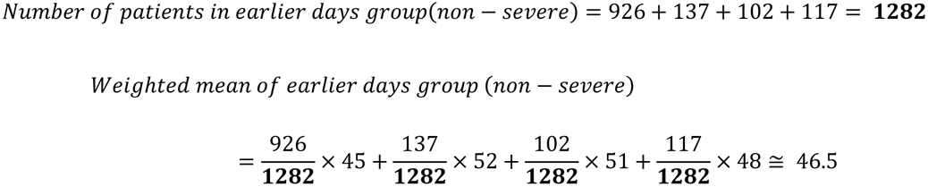
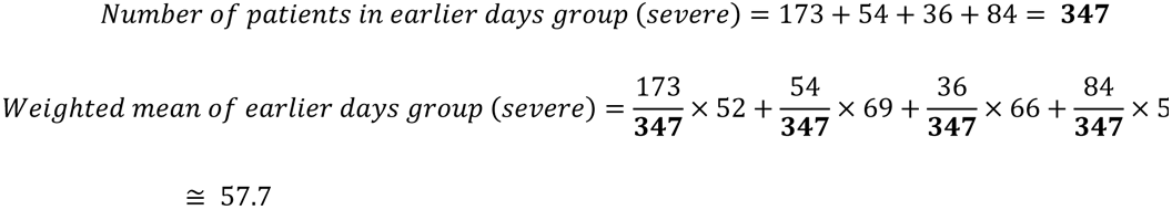
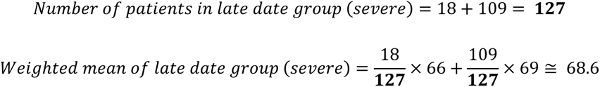
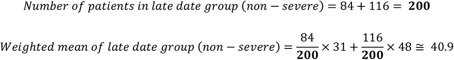
Considering the cause of these patterns, we found the matching between grouping the data by hyperbolic patterns and grouping by data cut-off days (Extended Data Fig. 7). We calculated weighted averages of age by grouping. In the earlier days group, non-severe was 46.5, severe was 57.7, and middle age (45-64). In the late date group, non-severe was 40.9, and severe was 68.6, which were mature age (25-44) and elderly (> 65), respectively.
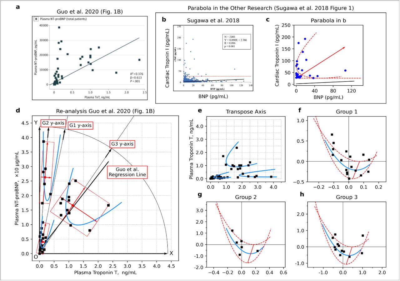
Surprisingly, we found unrecognized patterns during the data review process in a figure reported by Guo et al.35, which showed a relationship between N-terminal pro-brain natriuretic peptide (NT-proBNP) and Troponin T (TnT). There were three clusters of subgroup patterns, and each cluster could be fitted parabola (Fig. 4 a, b, Extended Data Fig. 8 & Extended Data Fig. 9).

a, Relationship between high sensitive C- reactive protein (hsCRP) and cardiac troponin T (TnT) in COVID-19 patients (left) and relationship between cardiac troponin T (TnT) and N-terminal pro-brain natriuretic peptide (NT-proBNP) (right). b, Data points from the right side of the panel a and fitting parabola. c, Three-dimensional data visualisation was constructed by mounting the value of hsCRP onto panel b. d, Linear regression analysis on the side surface of the parabolic cylinder in panel c. The points were replaced with their average if the values could not be determined due to overlapping (the points indicated by the left-pointing arrow and the error bar, which are the average and the range of values, respectively). Panel a was re-used from Guo T et al. JAMA Cardiol. 2020; 5(7):811-818. Figure 1 https://www.ncbi.nlm.nih.gov/labs/pmc/articles/PMC7101506/figure/hoi200026f1/ Copyright © 2020 Guo T et al. JAMA Cardiology. Creative Commons Attribution License (CC-BY). https://creativecommons.org/licenses/by/4.0/
The third subgroup pattern was similar to the pattern of ST-elevating myocardial infarction in the figure report by Budnik et al36. That study was a comparative study between Takotsubo cardiomyopathy (also known as stress cardiomyopathy or broken heart syndrome) and ST-elevating myocardial infarction. This tiled parabola appeared in another study on COVID-19 patients37, and the pattern had already appeared in other studies38, 39 before the pandemic. However, those patterns were not recognised by each author.
Additionally, In the case of dropping points to the horizontal axis (troponin axis), the histogram on the troponin axis results in bimodality. The above results matched the patterns reported by other studies (Extended Data Fig. 8)37, 40, 41.
Furthermore, by mounting the data of high-sensitivity C-Reactive protein (hsCRP) onto the third subgroup and constructing a parabolic cylinder, we found a pattern that might further be subdivided into two subgroups on the side surface of this parabolic cylinder (Fig. 4, c, d, & Extended Data Fig. 10).
Discussion
Using pattern recognition of hyperbolic shape as a key to discoveries in exploratory data analysis, we started research for traveller’s Thrombosis and COVID-19, and as a result, our concept of the geometrical viewpoint allowed us to discover many unrecognised patterns. Therefore, approaching data from geometry and exploring data focusing on hyperbolic patterns can be a practical option for researchers.
In traveller’s thrombosis, we obtained consistent results from two analyses (7.1 hours and 11.8 hours vs 9.2 hours and 12.1 hours) (Fig. 2, b, Extended Data Fig. 3). The discrepancy between the value of 7.1 hours and 8.5 hours seems to be explained by the miscalculation found in the data review process (see Methods). Although many researchers have led controversial discussions based on a single curve, our results implied two S-curves. We hypothesised two high-risk periods and two types of high-risk groups, which may have to be considered with the “factor V Leiden paradox”42 (Supplementary discussion 3: two high-risk periods and two types of high-risk groups?).
Another noteworthy point is the cyclic patterns (wave) (Fig. 2, c, d) and the raw-risk period just before 90 days in Kelman et al.27 (Extended Data Fig. 5). In Cannegieter et al.24, the cyclic pattern disappeared around 90 days, consistent with that the high-risk period in oral contraceptive (OC) use was the first three months (90 days)42. Also, the above raw-risk period explains extended-use type OC, which has a planned drug withdrawal, such as 84 active days and seven placebo days43–45. In addition, the uptrend in the data by Kelman et al.27 could be explained by depot agent type OC administrated 90 days cycle46. So, our findings imply that the 28 days cycle OC is attributable to the cyclic pattern, and both cycle type and extended-use type OC use is triggered by travel. An opposition may arise considering that both of relative risk reported by Martinelli et al.22 and Cannegieter et al.24 were low (Fig. 2, b), but it seems to be explained by bias derived from using their partner as control (Supplementary discussion 4: OC users and bias by their partner).
A halfway cycle (17.9 days) in Kelman et al.28 was explained by a mixture of the 28 days OC cycle and a type of HRT cycle (sequential type; daily estrogen dosing and 10–14 days progestogen)46. Also, another problem is that the wave in Cannegieter et al. was clear (thrombosis onset: March 1999-March 2000)25.
However, the wave in Kelman et al. (1981-1999)28 was not clear despite the exposures in Cannegieter et al. (air travel, train, bus, and 48.5% car trip)25 was more complex than Kelman et al. (only air travel)28, was answered by the history of HRT. In Kelman et al.28, there might be both young women taking OC and menopausal women receiving HRT, but only OC users might remain after the HERS study reported risk of HRT (1998)31, which was assisted by the growth of thrombosis onset slowed at the HERS study31 (Extended Data Fig. 6). Also, the above cars might be honeymoon cars. Although it was not decreasing, the result might be caused by some woman’s desire for joyful travel to Paris with HRT.
Our thought on pharmacoepidemiology in the real world, starting OC or HRT was triggered by travel and decision making of HRT connected to travel, which means that well-planned usage based on risk diversification may allow more safe use of OC and HRT.
In appreciation of our ideas to COVID-19, the dataset grouping by Matsushita et al.32 matched the grouping by data cut-off dates (Extended Data Fig. 7), and age structure diverged from middle age to mature and elderly, which was consistent with the hypothesis that COVID-19 spread from the seafood market. Middle-aged people might go into the workforce for manual labour treating fish containers, mature people might want to select IT jobs, and elderly people might stay in the house.
Interestingly, our analysis of the data by Guo et al.34 showed three clusters of subgroups, and one of those formed the tilted parabola. Also, the patterns matched the other studies (Fig. 4 a, b, Extended Data Fig. 8 & Extended Data Fig. 9)36–41. Considering the study by Budnik et al.36, those subgroups may have different biological mechanisms.
Additionally, we found patterns on the side surface of this parabolic cylinder (Fig. 4, c, d, & Extended Data Fig. 10). A paradoxical result on troponin was obtained just before the pandemic48, and Meisel et al. mentioned that the CRP to troponin ratio (CRP/troponin) could serve to differentiate between myopericarditis and acute myocardial ischemia (AMI), although not the study on COVID-19 patients. In COVID-19, Caro-Codón et al. reported interesting behaviour of CRP35. Also, a meta-analysis by Lagunas- Rangel reported that the lymphocyte-to-C-reactive protein ratio (LCR) level, which was not a simple measurement value but a ratio, might be related to an inflammatory process47.
The above studies might imply complex data structures in 2-dimensional and 3-dimensional scatter plots consisting of biomarker values, and our findings may serve cardiac biomarkers’ research field.
Supplementary, we explain the misuse of linear regression analysis in the study by Guo et al.35 (Supplementary discussion 5: misuse of linear regression analysis).
Although many studies on visualization of meta-analysis have been conducted48, our simple idea (hyperbolic pattern) has not been proposed. As named “error”, researchers usually view an error bar negatively. Also, in the wheel’s history, an invention of carriages, which was achieved by arranging the wheels in parallel, appeared in ancient times, but the idea of the bicycle, which was innovatively arranging wheels vertically, had not been conceived before the 19th century49, 50. Those mental blocks might have made it hard to imagine that vertical error bars provided information on a horizontal axis.
Evaluating our ideas, we discovered many oversights which were entirely beyond the initial scope. Appearing overlapped hyperbolic patterns may show poor data review and analysis. Currently, pattern recognition based on Artificial Intelligence (AI) detects cancer sites from images. Considering our discoveries by an analogy that Newton’s theory enabled the prediction of a planet’s orbit, implementing our idea (a kind of mathematical model or theory) in an AI system might assist another discovery of clinical issues.
Data Availability
Data availability statement. We analyzed clinical data published by other studies (third parties). Used data is identified by indicated information of citation (reference numbers and list of references). The corresponding author responds to inquiries in the case of measured values from published figures requested by reviewers or readers. Code availability statement. Correspondence author (KK) can respond to inquiries for the corresponding author's email address on offering the Python source code and spreadsheet software files for statistical analysis.
Methods
1. Numerical experiment
Unavoidably, this study conducted a numerical experiment to determine what curve approximates an edge of a confidence limit (Fig. 1, c).
Generally, a dose-response relationship often indicates an S-curve. Considering the distribution of a population at thrombosis risk and the cumulative thrombosis onset, each of those is monomodal distribution and the S-shaped curve, respectively. So, we decided to use the sigmoid function, which is generally used in curve fitting to dose-response data, as the formula for the S-curve fitting.
Contrastively, the curve expressing the end of a confidence interval (confidence limit) is a sum of the S-shaped curve and U-shaped curve because the width of the confidence interval narrows near the centre of distribution due to many cases around the points. Similarly, the confidence interval widens at the distribution edge due to the small number of cases (see Fig. 1, d).
Based on the above consideration, we selected the parabola as a candidate for the U-shaped curve because this curve was mathematically easy to handle (just junior high school level mathematics). So, we examined the validity of using parabola. However, mathematical proof of our conjecture was difficult because normal distribution was continuous probability distribution. So, we used a kind of discrete probability distribution, binomial distribution, to prove our conjecture experimentally because normal distribution could be approximated by binominal distribution. This idea was thinking in reverse of the usual statistical technique.
To generate binomial distribution data, we used the “BINOM.DIST” function, which is a function for calculating the probability of binomial distribution in a kind of spreadsheet software, Microsoft Excel○R (Microsoft Corporation, Redmond, Washington, US).
2. Equations for regression analysis
The equations for the S-shaped curve, the upper end of the confidence limit, and the lower end of the confidence limit, those equations are the following (1), (2), and (3), respectively. Note that in the below equations, the coefficient L is generally set as 1. So we used this equation under the condition as L=1 unless there is some reason.


Also, a complete square of the quadratic function that represents the parabola is the following equation (4).
 Besides, the point P is the apex of the parabola is the following (5).
 The following equations are the formula that expresses the outline of the distribution obtained by differential calculation on the S-shaped curve (6).

3. Analysis tools in this study
Reading values from the published figures were performed using the public domain software ImageJ in the public domain (https://imagej.net/Welcome). Regression analysis was performed using Python (Python Software Foundation, Delaware, USA https://www.python.org/psf/records/incorporation/). At this time, Python’s functional modules NumPy (NumFOCUS sponsored open-source project, https://numpy.org/), Pandas (NumFOCUS sponsored open-source project, https://pandas.pydata.org/), SciPy (NumFOCUS sponsored open-source project, https://www.scipy.org/) and Matplotlib (NumFOCUS sponsored open-source project, https://matplotlib.org/) were also used. Additionally, a function as “Chart option” of Microsoft Excel○R, which was shown in the “Trendline Options” section contained in “Format Trendline,” was used. In the case of symbolic formula manipulation was required, formula manipulation software wxMaxima (Project Maxima maintained by 27 volunteers, https://maxima.sourceforge.io/) was used.
4. Analysis 1A (dataset: Chandra et al.)7
1) Data review to validate eligibility for regression analysis
a. The process of data review in this analysis
As the first step, we performed data mapping. In the figure of meta-regression analysis reported by Chandra et al.7, it was not described what the data points correspond to the four original papers (Martinelli et al., 2003; Parkin et al., 2006; Cannegieter et al., 2006 and Kuipers et al., 2007)23–26. So, we measured the positions of each point and compared them with the original descriptions in the papers. In the second step, we performed a data review, which was an examination of the accuracy of cited values, and appropriately from the viewpoint of biomedicine. Our re-calculation confirmed the odds ratio (OR), confidence interval of the OR, and adjusted OR. In examining the values, we did not confirm Chandra et al.7 and the four authors23–26 because Chandra et al. described that each author did not respond to inquiry7. As a final step, we performed regression analysis using the eligible data for using regression analysis.
b. Data review
The data review showed some problems in the research reported by Cannegieter et al. and Martinelli et al.23, 25, and we excluded those data in the regression analysis. Also, there was a point to notice in the data reported by Parkin et al.24 (see Extended Data Fig. 1).
In confirming the accuracy of the values, there were no problems with the two studies (Kuipers et al. and Cannegieter et al.)25, 26, but there were problems in the other two studies (Martinelli et al. and Parkin et al.)23, 24.
In Martinelli et al.23, the problem was gender imbalance and unadjusted OR. In addition, although there were no explanations for the odds ratio described in the text cited by Chandra et al7, the above OR was presumed to be an unadjusted value, judging from the context. Comprehensively, judging from both calculation results and the original article, the odds ratio cited by Chandra et al.7 was strongly suspected of being an unadjusted value.
In Parkin et al.24, there was a discrepancy between the OR and the described OR calculated by us. Also, it was suspected that cells in the cross table were mistaken (e.g., in the table of Fig. 1a, the cell for control and the cell for total were mistaken). However, the error bar’s length was relatively small since the total number of cases was notably smaller than other studies. So, qualitatively, it could only be used to group data to find hyperbolic patterns.
In confirming from the viewpoint of the biomedicine side, there were no problems with two studies (Kuipers et al. and Parkin et al.)24, 26, but there were problems in the other two studies (Martinelli et al. and Cannegieter et al.)23, 25. In Martinelli et al.23, judging from the subtitle, “interaction with thrombophilia and oral contraceptives,” oral contraceptive (OC) bias was suspected. Initially, the study aimed to evaluate the interaction between OC use and travel. Considering the above, the OR had to be considered a value that contained a strong bias (see also Supplementary discussion 4: OC users and bias by their partner). In Cannegieter et al.25, the data contained car travel, and the other studies contained only air travel. So exposure factors were different, and there was a problem from the viewpoint of comparability (e.g., air pressure, dehydration, and time difference). Also, Chandra et al.7 showed two types of analysis results, including Cannegieter et al.25 and not. Besides, the cyclic pattern could be explained by OC use was observed (see Fig. 2, c & d). Also, Cannegieter et al.25 did not adjust the OR by sex and OC use. So, it was strongly suspected that there was a strong bias derived from the different types of exposure factors and OC.
Judging from the above two types of data reviews, we excluded the data reported by two studies (Martinelli et al. and Parkin et al.)23, 24. In the data reported by Kuipers et al.26, there was no problem. The data reported by Parkin et al.24 seemed to be used only for the purpose described above.
Interestingly, in four studies used in meta-regression analysis by Chandra et al.7, all the first authors’ names seem to be women’s names (“Suzanne” Cannegieter25, “Saskia” Kuipers26, “Ida” Martinelli23, “Lianne” Parkin24).
2) Regression Analysis
For the data judged as eligible, hyperbolic patterns were visually searched, and each data point was grouped into two groups. Then, a non-linear regression analysis using the formulas above was performed. In the fitting of the U-shaped curve, since there were many unknown coefficients for the number of data (there are seven unknowns, K1, K2, M, a, b, and c. in the equations (2) and (3)), the S-curve was fitted first, and the remaining unknown coefficients (a, b, c) were fitted to the residuals of the S-curve fitting (see equation (2) and (3)).
3) Additional analysis
As described above, the cyclic pattern in the data reported by Cannegieter et al.25 was observed, and we performed additional analysis. To conduct an appropriate non-linear regression analysis, we made an equation by combining two types of equations. The exponential decay equation was usually used to express radioactive decay in physics and clearance in medicine. The other was a trigonometric function (sine function) to express waveforms. The equation is shown in as below equation (7). Also, this scientific model (model formula) was used to estimate the ratio of patients by integral calculation.
 The data reported as a bar graph was weekly data (see Fig. 2, c and Extended Data Fig. 2). So, the week was converted into the number of days before the analysis, such as; the day getting off the vehicle was set as days 0, the first week was set as days 4, the second week was set as days 4 + 7, and the third week was set as days 4 + 7 × two, and the Nth week was set as days 4 + 7 × N.
Supplementary, according to the original description by Cannegieter et al.25, 68 patients developed thrombosis in the first week, and “233” patients developed thrombosis within eight weeks after travelling.
However, there was a slight discrepancy in the values read from the bar graph. The value in our measurement within eight weeks after travelling was “234”, but the effect of only one patient was allowed to be regarded as small (the description of 68 patients was the same.).
Cannegieter et al. described the number of patients who travelled with their partners to evaluate the effect of OC (Cannegieter et al., PLoS Med. 2006 Aug;3(8):e307., Table 2)25. We found some mismatches for the number of patients in the table, and the overall discrepancy was only one person by offset, and Cannegieter et al. described that there were derived from missing value25. The mismatch between our measurement and description might be related to the described explanation.
5. Analysis 1B (dataset: Philbrick et al.)4
1) Dataset search and data review
a. Dataset search
To validate the result of analysis 1A, we searched another dataset from meta-analysis or systematic review on the traveller’s thrombosis. To conduct this search, we used PubMed® setting the following search keywords: “economy class syndrome [Title] “ OR “traveler’s [Title] AND thrombosis [Title]” OR “traveler’s [Title] AND thromboembolism [Title]” OR “flight [Title] AND thrombosis [Title]” OR “flight [Title] AND thromboembolism [Title]” OR “flight-related [Title] AND thrombosis [Title]” OR “flight-related [Title] AND thromboembolism [Title]” OR “travel [Title] AND thrombosis [Title]” OR “travel [Title] AND thromboembolism [Title]” OR “travel-related [Title] AND thrombosis [Title]” OR “travel-related [Title] AND thromboembolism [Title]” (Filters: Meta-Analysis, Systematic Review).
As a result, we obtained the eight articles (da Silva LF et al. J Vasc Bras. 2021 10;20:e20200164; Benhaberou-Brun Perspect Infirm. 2010 7(3):16-7; Chandra et al. Ann Intern Med. 2009 151(3):180-90; Kuipers et al. J Intern Med. 2007 262(6):615-34; Philbrick et al. J Gen Intern Med. 2007 22(1):107-14; Hsieh et al. J Adv Nurs. 2005 51(1):83-98; Ansari et al. J Travel Med. 2005;12(3):142-54; Adi et al. BMC Cardiovasc Disord. 2004 19;4:7).
Subsequently, we selected articles containing available abstracts on PubMed® online, confirming the contents. As a candidate for our analysis, we selected a systematic review reported by Philbrick et al.4. The study was taken up by the ACP Journal Club of the American College of Physicians5 and another journal club10. So, it seemed to be a highly reputed study. Therefore, we regarded that the dataset contained in the research was suitable for validation.
Also, the research contained two lists of tables, one of which was a cohort studies dataset, and the other was the case-control studies. However, the case-control studies had many different exposure factors. So, we decided to use only the cohort studies dataset.
b. Data review
In the data review process, we reviewed the table containing ten cohort studies27, 28, 51–58 and found seven eligible cohort studies27, 51, 54–58 for regression analysis. In Gajic et al. and Kelman et al., the only distances were described28, 52, and Hughes et al. reported duration data for not per one flight (e.g., mean 39.4 h)53, so time data for regression analysis was unavailable.
Additionally, although Philbrick et al. described that incidence per million was 0.5 in table 2 of their article4, the number was incorrect because it was based on only 1998. In the original description, Clérel & Caillard mentioned that “According to the number of the passengers landing in the Aeroports de Paris, the incidence during 1998 is 0.5 per million passengers”27.
2) Regression Analysis
For the seven studies, data stratified by Pulmonary Embolism (PE) and Deep Vein Thrombosis (DVT), regression analysis was performed using an S-shaped curve formula (see equation (1)). In the case of curve-fitting on DVT data, we cancelled the setting of coefficient L=1 to increase the degree of freedom of the S-curve (Extended Data Fig. 3, b). To show the error bar in the figure (Extended Data Fig. 3), we did not use the values of confidence limits described in the report by Philbrick et al.4, but values were re-calculated from the number of cases using Wilson’s method because data review result described above showed the error of values at the citation.
In the seven studies, not OR or relative risk (RR), only the data indicating the incidence rate of thrombosis was available. So, the hyperbolic pattern did not appear in the figure theoretically, and we performed only the S-shaped curve fitting. This mechanism is explanted from the following calculation on a confidence interval of a ratio.
The formula for a 95% confidence limit of a ratio using binomial approximation is expressed by the following formula: P is a ratio, and N is the number of trials.
 In the above equation, the fraction’s numerator is not a constant value and does not depend on only the N, which is associated with a data point’s position in a population (see Fig. 1).
In this regression analysis, converting time categories to time points was necessary, so we performed this in three directions. The first one was taking the midpoint if the category was not the end of a category sequence (e.g., 10-15 h could be converted to 12.5 h). The second one was taking the midpoint between the time point of 0 and the lower limit of the category if the category was the lower end of a category sequence (e.g., <3 h could be converted to 1.5 h). The third one was taking the sum of the value of the upper limit and the value of the midpoint between the time point of 0 and the lower limit of the category sequence if the category was the upper side of a category sequence (e.g., > 12 h could be converted to 12 h + 1.5 h =13.5 h). Details of conversions are shown below (the original time category is shown in brackets).
Belcaro et al. [10-15 h]: 12.5 h (Belcaro, G. et al., Angiology. 2001;52(6):369-74.)51; Clérel et al. [12.7 h]: 12.7 h (Clérel, M., & Caillard, G., Bull Acad Natl Med. 1999;183(5):985-97.)27; Jacobson et al. [11 h]: 11 h; Lapostolle et al. [<3 h, 3-6 h, 6-9 h, 9-12 h,> 12 h]: 1.5 h, 4.5 h, 7.5 h, 10.5 h, 13.5 h (12 + 1.5 = 13.5 h) (Jacobson, B.F. et al., S Afr Med J. 2003;93(7):522-8.)54; Pérez-Rodríguez et al. [<6 h, 6-8 h,> 8 h]: 3 h, 7 h, 11 h (8 + 3 = 11 h) (Pérez-Rodríguez, E. et al., Arch Intern Med. 2003;163(22):2766-70.)56; Schwarz et al. 2002 [> 8 h]: 12 h (midpoint of 0-8 h is 4 h and 8 + 4 = 12 hours) (Schwarz, T. et al., Blood Coagul Fibrinolysis. 2002;13(8):755-7.)57; Schwarz et al. 2003 [> 8 h]: 12 h (midpoint of 0-8 h is 4 h and 8 + 4 = 12 hours) (Schwarz, T. et al., Arch Intern Med. 2003 2003;163(22):2759-64.)58.
3) Additional analysis
a. Regression analysis (data: Kelman et al.28)
In the review process, a cyclic pattern was observed. So, we worked on regression analysis.
Considering that onset of thrombosis tends to increase again, an equation upward-sloping curve was added to equation (7). The equation is the following (9).

b. Analysis by using correlogram (data: Clérel & Caillard27)
We considered using the “correlogram” in this study because it was more practical than observing the original data’s fluctuation. Periodic fluctuation patterns may be unclear when looking at the original data alone, but potential patterns can be obtained using a correlogram, a data visualization method for analyzing time-series data. Also, as the correlation coefficient plotted on the correlogram, we decided to use Spearman’s rank correlation coefficient instead of Pearson’s product-moment correlation coefficient, which is easily affected by outliers. Also, we performed a non-linear regression analysis using a mathematical formula (10) that includes two sine functions.
 In correlogram creation, firstly, a combination of data (data X1, data X1) was created by arranging the original time series data (data X1) and a new combination (data X1, data X1’) was created by shifting one of them. Secondary, the correlation coefficient (also called the auto-correlation coefficient) between the original time-series data (data X1) and the sifted time-series data (data X1’), except at the ends of two types of time-series data where some correspondence could not be formed. By repeating shifting the time string data and calculating the correlation coefficient, the locus of the correlation coefficient becomes the shape of waves. Firstly (original waves of time strings are overlapped), the correlation coefficient is 1, and the value of the correlation coefficient gradually decreases as the distance of the overlap increases. Finally (the wave is inverted), the correlation coefficient is -1.
In this study, since the risk of developing thrombosis is expected to increase as travel time increases by cumulative exposure to environmental risk factors, it was necessary to investigate whether the fluctuations in the number of patients really reflect the periodicity by confirming the fluctuation of the percentage of onset patients to the total number of passengers to examine whether the fluctuation reflects the increase or decrease in the number of passengers. However, this confirmation could not be made because data on the total number of passengers was not available. So, we focused on a method that suppressed the influence of the height of the wave and evaluated only curved shapes. Therefore, we decided to draw a correlogram that reduced wave height by the property of the correlation coefficient, which fluctuates only between -1 and 1.
However, Pearson’s product-moment correlation coefficient has a weakness: it is easily affected by outliers. Also, as the progress of shifting the one side of the data string against the original data, their correspondence decreases. In other words, the number of data that can be used to calculate the correlation coefficient gradually decreases. This problem may cause considerable variation between the calculated correlation coefficients. Also, the thrombosis onset was recorded in 1-hour increments, and the length of the data was limited to 24 hours (24 data points). Therefore, instead of Pearson’s product-moment correlation coefficient, we decided to create a correlogram using Spearman’s rank correlation coefficient.
6. Analysis 2 (dataset: COVID-19)33
1) Dataset search and data review
c. Dataset search
To apply our idea to COVID-19 problems, one of the authors (KK) searched hyperbolic patterns using a search service Google (https://www.google.com/) provided by Google Inc., which allows displaying search results as “images.” The search keyword was “COVID-19 AND Meta-analysis”. In the case of displaying bubble charts instead of the error bars, the size of the bubble chart (inversely proportional to the length of the error bars) was converted in mind. Consequently, we selected a suspicious study reported by Matsushita et al. (Matsushita, K. et al., Glob Heart. 2020;15(1):64.)33 that included eight research papers in Figure 559–66.
d. Data review
As in the case of Analysis 1, we reviewed to evaluate numerical accuracy and appropriateness from the viewpoints of biomedicine. Since Matsushita et al.33 originally made web Figure 5 and excluded 17 studies35, 67–82 from avoiding duplication of studies in Wuhan city in the making of Figure 5, we inspected both of studies in Figure 5 (8 studies) and only in web Figure 5 (17 studies).
Based on the results shown below, considering the issue of comparability, we excluded the data reported by Yuan et al.65 and Wang L. et al63. Also, we re-calculated age difference using data reported by Guan et al. 61 (see Extended Data Fig. 1).
As a side note, the numbers assigned to each point in figure 3 were the same numbers described in the original figure by Matsushita et al.33, and the correspondence relationship is the following (Fig. 3): No.2: Cao et al. (Cao, J. et al., Intensive Care Med. 2020;46(5):851-853.)59, No.7: Deng et al. (Deng, Y. et al., Chin Med J (Engl). 2020;133(11):1261-1267.)60, No.8: Guan et al. (Guan, W.J. et al., N Engl J Med. 2020;382(18):1708-1720.)61, No.19: Wang D. et al. (Wang, D. et al., JAMA. 2020;323(11):1061-1069.)62, No.20: Wang L. et al. (Wang, L. et al., J Infect. 2020;80(6):639-645.)63, No.21: Wu et al. (Wu, C. et al., JAMA Intern Med. 2020;180(7):934-943.)64, No.23: Yuan et al. (Yuan, M. et al., PLoS One. 2020;15(3):e0230548)65, No.25: Zhou et al. (Zhou, F. et al., Lancet. 2020;395(10229):1054-1062.)66.
(i) No.8 Guan et al. (Guan, W.J. et al., N Engl J Med. 2020;382(18):1708-1720.)61
We found a matter of consideration in the data reported by Guan et al61. Initially, features of that data differed from the other studies, which contained only cases reported from Wuhan city. In contrast, the data reported by Guan et al.61 contained cases outside of Wuhan city. Also, regarding the situation of the early pandemic, there were concerns about the presence of patients who could not take appropriate medication, especially in non-urban areas. Also, Matsushita et al.33 did not use the data divided into the severe and non- severe groups by Guan et al.61 but used the data divided into yes and no by Guan et al.61 using “Presence of Primary Composite End Point”, which means entry to the intensive care unit (ICU), use of mechanical ventilation, or death.
Since Cao et al. (Wuhan University Zhongnan Hospital in Wuhan; affiliation of Dr Jianlei Cao: Department of Cardiology)59 and Wang et al. (Zhongnan Hospital of Wuhan University in Wuhan; affiliation of Dawei Wang, MD: Department of Critical Care Medicine)62 also used ICU admission as a criterion for severe or non-severe, we examined the rate of severely ill patients and resulted in 21.4% (18/84) and 35.3% (36/102), respectively. However, in the case of using the “Presence of Primary Composite End Point”, the percentage was only 6.5% (67/1032). Whereas, in the original categorisation by Guan et al.61, the percentage was 18.7% (173/926). Therefore, we prioritised the original classification of severe or non-severe by Guan et al61.
(ii) No. 9 Guo et al. (Guo et al. JAMA Cardiol. 2020;5(7):811- 818)35 (only in eFigure5)
We read this paper carefully, a report from Wuhan city published in March 2020. Although this document may significantly influence the studies on COVID-19 (according to the JAMA Cardiology website, the article was cited more than 1,500 as of 20th September 2021), we found that misuse of linear regression analysis in Guo et al. on a figure (see Extended Data Fig. 8 & Supplementary discussion 5: misuse of linear regression analysis)35.
Additionally, three subgroup patterns appeared in a figure reported by Guo et al., although they did not mention it. Precautionary, we considered whether the subgroups in the Guo et al.35 affected the meta- analysis on the web Figure 5. The data in other studies allowed to be expected to have the same subgroups because the patient data described by Guo et al.71 and other studies were reported from China (most of them were in Wuhan City).
(iii) No. 20 Wang L. et al. (Wang, D. et al., JAMA. 2020;323(11):1061-1069.)63
In confirming from the viewpoint of the biomedicine side, it was found that a significant matter of consideration on eligibility, patient population reported by Wang L. et al. was limited to over age 6063. The title was “Coronavirus disease 2019 in elderly patients: Characteristics and prognostic factors based on 4- week follow-up”, and Matsushita et al. 33 had to pay attention to the word “elderly”.
(iv) No.23 Yuan M. et al. (Yuan M. et al., PLoS One. 2020;15(3):e0230548.)65
In confirming the accuracy of values, we found a mixture of values derived from different calculation types in Figure 5: Odds Ratio (OR), hazard ratio, and a value derived from the imputation of 0.5 for the zero cells in the cross table. The zero cells appeared in the study reported by Yuan et al65. Yuan M. et al. studied 27 patients who confirmed novel coronavirus infected pneumonia (NCIP) during the early phase of the pandemic to evaluate radiologic characteristics65. In other words, the difficulty of patient enrollment might cause a small sample size, which seemed to be a concern from the viewpoint of comparability (c.f., Guan W. et al., n=109961; Zhou F. et al., n=19166; Wang D. et al., n=13862; Wu C. et al. n=20164; Cao J. et al., n=10259; Deng Y. et al., n=22560).
(v) The term “Cardiovascular disease (CVD).”
There was an inconsistency in the studies on “Cardiovascular disease (CVD).” For example, vascular diseases such as arrhythmia and arteriosclerosis are also classified as CVD, but in the studies reported by Guan et al.61 and Zhou et al.66, the term “Coronary heart disease” was used. Also, “Cardiac disease” was used by Yuan et al.65, “Heart disease” was used by Deng et al.60, and “Cardiovascular disease” was used by Wang L et al63.
2) Regression analysis
Considering the problem of comparability, we re-calculated OR and visually grouped it into two hyperbolic patterns. In the case of S-shaped curve fitting, since there were many unknown coefficients for the number of data (3 unknown coefficients of K1, K2, and M), the regression analysis was performed after setting the zero point value. In the fitting of upper and lower curves, since there were many unknown coefficients (K1, K2, M, a, b, c), we firstly obtained the coefficient of M (see equation (1)) by the curve fitting of the S- shaped curve, and then performed curve fitting of parabolas. After substituting M for x value of apex in equation (4) (see equations (4) & (5)), regression analysis was performed on the data in the middle row of Figure 3 (Fig. 3, d-f). Finally, the S-shaped curve and the parabola were merged (Fig. 3, g-i).
3) Calculation of weighted average
In earlier days group, the median age and the number of cases are tabulated by severe and non- severe cases as follows. Guan W. et al. (severe n=173 [age: 52] vs non-severe n=926 [age: 45])61, Zhou F. et al. (non-survival n=54 [age: 69] vs survival n=137 [age: 52])66, Wang D. et al. (ICU n=36 [age: 66] vs non- ICU n=102 [age: 51])62, Wu C. et al. (ARDS n=84 [age: 58.5] vs non-ARDS n=117 [age: 48])64, and whole of earlier days group (severe n = 347 vs non-severe n = 1282).
The weighted average of severe and non-severe in the earlier days group was calculated from these values by the following formulas. In the earlier days group, the weighted average of severe and non-severe were 57.7 and 46.5, respectively.
In later days group, the median age and the number of cases are tabulated by severe and non-severe cases as follows. Cao J. et al. (ICU n=18 [age: 66] vs non-ICU n=84 [age: 31])59, Deng Y. et al. (Death n=109 [age: 69] vs survival n=116 [age: 48])60, and whole of later days group (severe n = 127 vs non-severe n = 200).
The weighted average of severe and non-severe in the late date group was calculated from these values by the following formulas. In the late date group, the weighted average of severe and non-severe were 68.6 years and 40.9, respectively.
4) Additional analysis: Regression analysis on the parabolic cylinder
One of the authors (KK) found a way to fit an appropriate curve to the data reported by Guo et al., performing trial and error with his mathematical intuition (Fig. 4). Firstly, he calculated the centre of gravity of the data by each subgroup cluster (centre of gravity: the average of the values on the horizontal axis x and the average of the values on the vertical axis y). Second, he obtained equations of three straight lines passing through the origin and centres of gravity. Thirdly, he obtained the equation of a straight line passing through each centre of gravity and intersecting the straight lines obtained above. Fourthly, he re-set new origin as each centre of gravity and regarded the above two crossed lines as a small cartesian coordinate system. Finally, he applied parabola fitting with Excel○R in each new cartesian coordinate system. In this curve fitting, he used the data of distance between each data point and the straight line obtained secondary, and the data of distance between each data point and the straight line obtained firstly (see “distance from a point to a line” in a high school textbook).
5) Making example data
To explain the misuse of linear regression analysis in Guo et al.35, we made the following data to show the example. It allows being used in R by copying and pasting the following.
Value_X<-
c(0.04, 0.08, 0.12, 0.16, 0.2, 0.24, 0.28, 0.32, 0.36, 0.4, 0.44, 0.48, 0.52, 0.56, 0.6, 0.64, 0.68, 0.72, 0.76, 0.8, 0 .84, 0.88, 0.92, 0.96, 1, 1.04, 1.08, 1.12, 1.16, 1.2, 1.24, 1.28, 1.32, 1.36, 1.4, 1.44, 1.48, 1.52, 1.56, 1.6, 1.64, 1.68, 1.72, 1.76, 1.8, 1.84, 1.88, 1.92, 1.96, 2, 2.04, 2.08, 2.12, 2.16, 2.2, 2.24, 2.28, 2.32, 2.36, 2.4, 2.44, 2.48, 2.52, 2.56, 2.6, 2.64, 2.68, 2.72, 2.76, 2.8, 2.84, 2.88, 2.92, 2.96, 3, 3.04, 3.08, 3.12, 3.16, 3.2, 3.24, 3.28, 3.32, 3.36, 3.4, 3.44, 3.48, 3.52, 3.56, 3.6, 3.64, 3.68, 3.72, 3.76, 3.8, 3.84, 3.88, 3.92, 3.96, 4)
Value_Y<-
c(2.01742, 2.02749, 2.04454, 2.02009, 2.03445, 2.04749, 2.03641, 1.99047, 1.98671, 2.06711, 2.09772, 2.005 39, 1.86985, 2.01679, 2.12183, 1.94453, 1.86497, 1.87444, 2.09483, 1.91073, 1.69244, 1.70968, 1.81376, 2.0 4219, 1.69059, 1.75939, 1.95321, 1.8417, 1.58169, 1.75585, 1.73497, 1.47847, 1.9115, 1.44962, 1.85063, 1.3 2298, 1.28437, 1.74621, 1.27232, 1.32763, 1.575, 1.56609, 1.5933, 1.76707, 1.11264, 1.06188, 1.40139, 0.94084, 1.0756, 1.38507, 1.33408, 1.54375, 1.60257, 1.02029, 0.98612, 1.79094, 0.97916, 0.81212, 1.1484, 1.5168, 1.70236, 1.38945, 1.69072, 1.75042, 1.67571, 1.38623, 1.81503, 1.80665, 1.41073, 2.3175, 2.24852, 1.75 95, 2.81818, 1.93654, 2.36998, 2.0987, 2.19539, 2.44747, 2.57255, 3.24637, 2.78881, 3.51638, 2.68107, 2.87 259, 4.3749, 3.13393, 3.92099, 4.1223, 3.78584, 4.9666, 5.4888, 5.70712, 4.84752, 5.1409, 6.31637, 5.53198, 6.89257, 7.86387, 7.98237, 8.64705)
7. Statement of our intention for data review results
To clarify our stance, we mention this statement of intention for results. In this article, we pointed out many overlooking and errors. However, we have no intention to attack previous works because our analysis results owing to their original works, including original research articles, reported valuable data and articles of meta-analysis synthesised valuable datasets. Since just a scientist had better reconfirm the previous studies with no preconception with being grateful to the researchers of those studies, we carefully reviewed the data reported by previous studies. We highly respect previous works, which have the intention to solve medical issues, although some articles contained technical errors.
Competing interest declaration
Keiichiro Kimoto has been in charge of external advisor for Data Strategy Research Institute but reserved no financial support for this study. Except for this, the authors have no conflicts of interest and have no financial disclosures that should be disclosed.
Author contributions
Keiichiro Kimoto takes responsibility for this research, making study concepts, data analysis, interpretation of analysis results, and drafting the manuscript. Dr. Yamakuchi contributed to interpreting analysis results, manuscript drafting, supervision and administrative role. Dr. Takenouchi contributed to the supervision. Dr. Hashiguchi contributed to the study concept, interpretation of analysis results, manuscript drafting, supervision, and administrative role.
Additional information
This article has supplementary information that contains supplementary discussions.
Data availability statement
We analyzed clinical data published by other studies (third parties). Used data is identified by indicated information of citation (reference numbers and list of references). The corresponding author responds to inquiries in the case of measured values from published figures requested by reviewers or readers.
Code availability statement
Correspondence author (KK) can respond to inquiries for the corresponding author’s email address on offering the Python source code and spreadsheet software files for statistical analysis.
Extended data figures & figure legends

We applied our concept to traveller’s thrombosis and COVID-19. These were similar in research history (see Supplementary discussion 1: history of traveller’s thrombosis & Supplementary discussion 2: research situations of COVID-19 related thrombosis). In the case of traveller’s thrombosis, we analysed a dataset collected by Chandra et al. and Philbrick et al4, 7. In the case of COVID-19, we analysed a dataset collected by Matsushita et al7. Flow charts show data accept or reject flows. Since duplicating data, Matsushita et al. selected only eight studies data (25 studies included in initial web Figure 5)33.

a, A bar graph showing the relationship between weeks after travel and the number of thrombosis onset in a figure reported by Cannegieter et al25. b, Re-expressing as a two-dimensional bar graph avoiding the three-dimensional representation. c, Applying a damped wave by non-linear regression analysis. d, Extraction of damped wave part by subtracting the monotonic decrease function. e, Dividing into 2 sub-group areas by the envelopes of the damped wave that touch the lower parts of the wave. f, Enlarged and added explanation of the ratio of the area. Cannegieter et al.25 used the data up to week eight, and the ratio of subgroup 2 to the total number of patients (ratio of S2 to the area of S1 + S2) was 30.0%. In the integration for the infinite interval, it was 30.8%. Peak shifts of the wave (peak position of the wave shifted from the original to the other) appeared when comparing panels d and f due to putting by regression curve located in the centre. Panel a was re-used from Cannegieter et al. PLoS Med. 2006; 3(8):e307. Figure 1. https://www.ncbi.nlm.nih.gov/labs/pmc/articles/PMC1551914/figure/pmed-0030307-g001/ Copyright © 2006 Cannegieter et al. Creative Commons Attribution License. In 2006, the Creative Commons Attribution 2.0 Generic, License (CC BY 2.0) was available. https://creativecommons.org/licenses/by/2.0/

a, data stratification by Pulmonary Embolism (PE) and Deep Vein Thrombosis (DVT). b, Application of S-shaped curve by regression analysis to the stratified data. The value in the bracket (panel b) is the point of time converted from the time category (see Methods). Philbrick et al.4 reported the result of a systematic review with a table (list). In contrast, this visualising allows us to extract latent information.
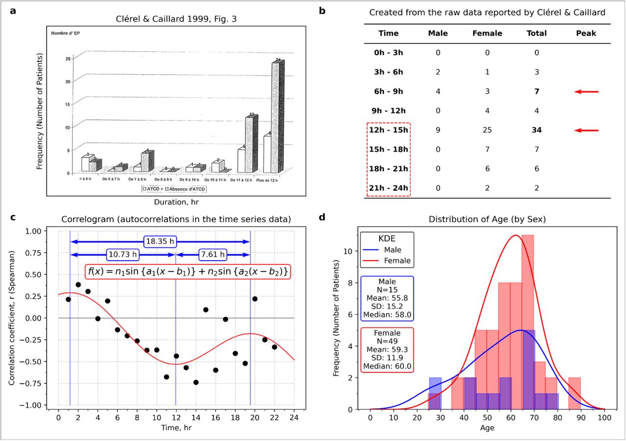
a, A figure made by Clérel & Caillard27 showed a relationship between travel time and the thrombosis onset in the case of stratification by medical history of thrombosis. b, The relationship between time and thrombosis (prepared from Table 1 reported by Clérel & Caillard27). c, Correlogram (prepared from Table 1 reported by Clérel & Caillard27). d, Age distribution by sex (made from Table 1 reported by Clérel & Caillard27). As shown in panel a, Clérel & Caillard27 summarised all the data for 12 hours or more, but there were two peaks (see panel b). Judging from the age distribution (panel d), the number of women patients was more significant than that of men, but there was no difference between the age ranges. In panel c, there was a periodic pattern. Panel a reproduced from Clérel & Caillard. Syndrome thrombo-embolique de la station assise prolongée et vols de longue durée: l’expérience du Service Médical d’Urgence d’Aéroports De Paris. Bull Acad Natl Med. 1999; 183(5):985-997. discussion 997-1001. Figure 3. Copyright © 1999 Elsevier Masson SAS. All rights reserved. Académie Nationale de Médecine.

a, A thrombosis onset distribution reported by Kelman et al28. b, The regression curve is located in the centre of all average points (the points express the average of thrombosis onset during seven days). c, Curve fitting to the residual data of the regression curve in panel b. d, Application of damped wave function and adding interpretation of the results assuming some women started taking oral contraceptives (OC) in the timing of travel. The observed cyclic pattern was relatively unclear than Cannegieter et al.25 (see Fig. 2). Noteworthy, the thrombosis onset downed in the days before 90 days, and it seems to be the scheduled withdrawal periodof OC use. This figure was re-used and re-drawn from Kelman et al. BMJ. 2003; 327(7423):1072. Figure 1 https://www.ncbi.nlm.nih.gov/labs/pmc/articles/PMC261739/figure/fig1/ Copyright © 2003 BMJ Publishing Group Ltd. All rights reserved. The BMJ permission team thankfully confirm this figure adaptation. Also, we obtained permission to re-use.

a, Clérel & Caillard mentioned that “their incidence increases during the last years, corresponding to the growth of air traffic and mainly to the increase of long duration without stop flight.”27 c, Chronology of various guidelines on HRT. In the newly figure (panel b), the increase in thrombosis was associated with the issuance time of guidelines for HRT. HRT was recommended for menopausal women in the 1990s, but its effectiveness was questioned in the HERS trial (1998)31. Also, the risk was discovered in the WHI trial at the interim analysis (2002)32. It might be the effect of the publication on the HERS study (1998)31 that the increase of thromboses was relatively small in 1998 despite the publication of two documents recommended in 1997. Panel a was reproduced from Clérel & Caillard. Syndrome thrombo-embolique de la station assise prolongée et vols de longue durée: l’expérience du Service Médical d’Urgence d’Aéroports De Paris. Bull Acad Natl Med. 1999; 183(5):985-997. discussion 997-1001. Figure 1.
Copyright © 1999 Elsevier Masson SAS. All rights reserved. Académie Nationale de Médecine.

The data acquisition period in each study was displayed in Gantt chart format. The date display format is year-month-day. The correspondence between numbers and authors is as follows: No.2: Cao et al. (Cao, J. et al., Intensive Care Med. 2020;46(5):851-853.)59, No.7: Deng et al. (Deng, Y. et al., Chin Med J (Engl). 2020;133(11):1261- 1267.)60, No.8: Guan et al. (Guan, W.J. et al., N Engl J Med. 2020;382(18):1708-1720.)61, No.19: Wang D. et al. (Wang, D. et al., JAMA. 2020;323(11):1061-1069.)62, No.20: Wang L. et al. (Wang, L. et al., J Infect. 2020;80(6):639-645.)63, No.21: Wu et al. (Wu, C. et al., JAMA Intern Med. 2020;180(7):934-943.)64, No.25: Zhou et al. (Zhou, F. et al., Lancet. 2020;395(10229):1054-1062.)66. Abbreviations: ARDS (Acute Respiratory Distress Syndrome), ICU (Intensive Care Unit). The number in parentheses means median age. The number in the bracket means standard deviation or interquartile range.

a, Guo et al. JAMA Cardiol. 2020; 5(7):811-818. Figure 1B https://www.ncbi.nlm.nih.gov/labs/pmc/articles/PMC7101506/figure/hoi200026f1/
Copyright © 2020 Guo T et al. JAMA Cardiology. Creative Commons Attribution License (CC-BY). b, Marginal distribution of the scatter plot data. c, Wang et al. Front Cardiovasc Med. 2020; (7): 147. Figure 1 (upper, x-axis: troponin I, pg/mL; y-axis: BNP, pg/mL; lower, x-axis: troponin I, pg/mL; y-axis: lymphocyte, %)37. https://www.ncbi.nlm.nih.gov/labs/pmc/articles/PMC7477309/figure/F1/
Copyright © 2020 Wang, Zheng, Tong, Wang, Lv, Xi and Liu. CC BY License. d, Caro-Codón et al. Eur J Heart Fail. 2021; 23(3):456-464. Figure 1B (x-axis, LN (troponin I))40. https://www.ncbi.nlm.nih.gov/labs/pmc/articles/PMC8013330/figure/ejhf2095-fig-0001/
Copyright © 2021 European Society of Cardiology. All rights reserved. This Figure can be used for unrestricted research re-use and analysis in any form or by any means with acknowledgement of the original source as part of the COVID-19 public health emergency, for the duration of the emergency. e, Demir et al. Am J Cardiol. 2021; 147:129-136. Figure 2 (upper: admission; lower: peak measurements; x-axis: troponin T, ng/L)41. https://www.ncbi.nlm.nih.gov/labs/pmc/articles/PMC7895690/figure/fig0002/
Copyright © 2021 Elsevier Inc. All rights reserved. This figure is granted for unrestricted research re-use and analyses in any form or by any means with acknowledgement of the original source by Elsevier for as long as the COVID-19 resource centre remains active. f, Virtual example on regression analysis (see Supplementary discussion 5: misuse of linear regression analysis). In panel b (also c, d, and e), the histogram was bimodal (marked “A” and “B”). The crescent-shape pattern closely resembled the ST-segment elevation myocardial infarction group pattern that appeared in the study by Budnik et al36.

a, A scatter plot showing the relationship between cardiac troponin T (TnT) and N-terminal pro-brain natriuretic peptide (NT-proBNP) in a patient with COVID-1935. b, Scatter plot to investigate the relationship between brain natriuretic peptide (BNP) and cardiac troponin I (cTnl) in healthy subjects reported by Sugawa et al38. c, The visible points that exceeded the value of 26.2 pg/mL (red line in panel b) were re-plotted with parabola (not accurate regression analysis). d, Visible points in the figure reported by Guo et al.35 with parabolas. e, Transposed panel d for easy comparison. f, Group 1 in the small coordinate system (centre of gravity as the origin of the coordinate system). g, Group 2 in the small coordinate system. h, Group 3 in the small coordinate system. In panel f-h, the upper curve is expressed by a quadratic function, in which a coefficient of the quadratic term is equal to a value of the coefficient of the quadratic term for the solid curve multiplied by 3/2. In the lower curve, a coefficient of the quadratic term of the solid curve multiplied by 2/3. Most data points located inside the crescent-shaped region enclosed by the parabolas, but the reason was unclear. Panel a was re-used from Guo T et al. JAMA Cardiol. 2020; 5(7):811-818. Figure 1B https://www.ncbi.nlm.nih.gov/labs/pmc/articles/PMC7101506/figure/hoi200026f1/ Copyright © 2020 Guo T et al. JAMA Cardiology. Creative Commons Attribution License (CC-BY). https://creativecommons.org/licenses/by/4.0/ Panel b was re-used from Sugawa et al. Sci Rep. 2018; 8(1):5120. Figure 1. https://www.ncbi.nlm.nih.gov/labs/pmc/articles/PMC5865159/figure/Fig1/ Copyright © 2018 The Authors. CC-BY 4.0 License
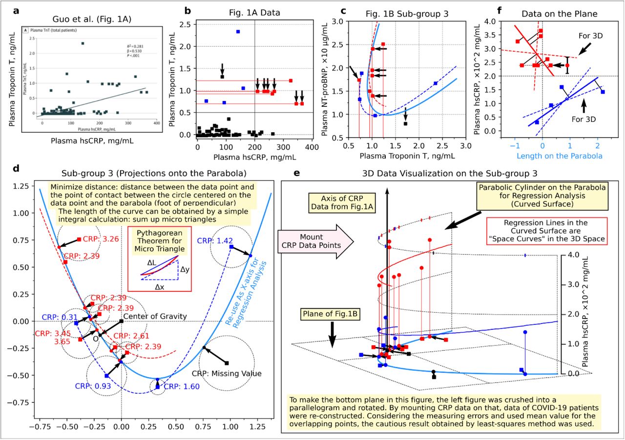
a, Scatter plot showing the relationship between high sensitive C-reactive protein (hsCRP) and troponin T (TnT) 35. b, Re-drawn scatter plot with a vertical line around hsCRP = 200 mg/mL = 2.0 × 10² mg/mL. c, Enlarged subgroup 3 in the panel d of Extended Data Fig. 9 (data exceeding hsCRP = 200 mg/mL are indicated by red, data not exceeding hsCRP = 200 mg/mL are indicated by blue). d, Enlarged subgroup 3 of the panel d in Extended Fig. 9 with the foot of the perpendicular from each data point to the parabola. e, The hsCRP value of each patient placed on panel d (shown as a three-dimensional plot). f, The side surface of the parabolic cylinder. The point of TnT = 1.31 observed in panel b is not included in panel c, and the point of TnT = 1.71 in panel c is not included in panel b (inconsistent). In panel e, the projection of the data points onto the parabola was used as new points. In panels, e and f, some points of CRP value could not be determined because of overlapping, so those points were replaced with the average value (the points indicated by the left-pointing arrows and the error bar, which are the average values and the range of values, respectively). Panel a was re-used from Guo et al. JAMA Cardiol. 2020; 5(7):811-818. Figure 1. https://www.ncbi.nlm.nih.gov/labs/pmc/articles/PMC7101506/figure/hoi200026f1/ Copyright © 2020 Guo T et al. JAMA Cardiology. Creative Commons Attribution License (CC-BY). https://creativecommons.org/licenses/by/4.0/
Acknowledgements
One of the authors, Keiichiro Kimoto, appreciates the kindful encouragement of Hideo Yoshioka, MEcon., who is in charge of the Data Strategy Research Institute representative.


